Unlocking CSS' Creative Toolbox


The Flexbox Formula

Learning Outcome
1
What is flex-box & its properties?
2
How to embed videos on a webpage?
3
How to stack elements on a webpage?
Let's Embark On A Cosmic Journey By Building A Space-Themed Website!
How Can Users Be Guided Through A Website's Different Pages?
By implementing <nav> element
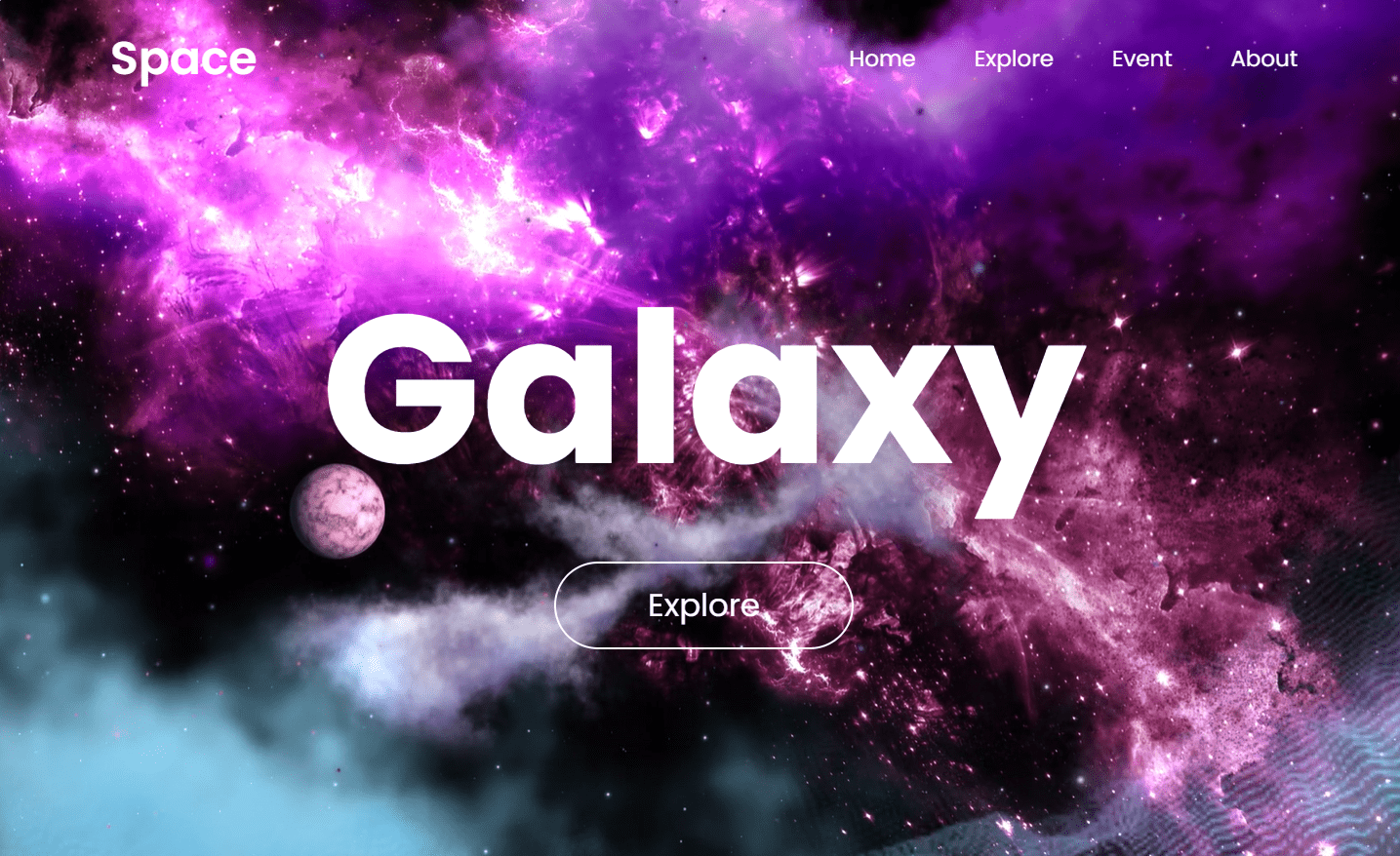

What Is <nav> Element?
The `<nav>` element is a semantic tag that defines navigation links or menus on a webpage
Space
Home
Explore
Event
About
<nav>
<a href="#" class="logo">Space</a>
 <ul type="none">
   <li><a href="">Home</a></li>
   <li><a href="">Explore</a></li>
   <li><a href="#">Event</a></li>
   <li><a href="#">About</a></li>
 </ul>
</nav>
But we want the layout of menus in a horizontal structure
How Can CSS Improve Layout Efficiently?
nav {
    width: 100%;
    position: absolute;
    top: 0;
    left: 0;
    padding: 20px 8%;
    display: flex;
}
With the help of flexbox
What is display: flex; ?
Aligns the element from left to right
Space
Home
Explore
Event
About
Lists
The lists is now arranged using flex i.e horizontally
Lets Arrange The Elements Of Nav Using Inline-Block
nav ul li {
    display: inline-block;
}
Space
Home
Explore
Event
About
The lists is now arranged using inline-block
How <nav> works on our website?

The <nav> Creates Clickable Links To
Other Pages
Let's Get Started With Flex-Box

What Does display-flex; Do?
Flex container i.e parent
Flex child
It turns an element into a flex container, allowing easy layout control of its children
What Is Flexbox?
Flexbox provides an efficient and flexible way to distribute space and align elements within a container
Flex container i.e parent
Flex children
Why Flexbox?
Flexible & responsive layouts
Powerful alignment capabilities
Reorder elements without changing HTML
1
4
3
5
6
2

How Can We Align Items Using Flexbox?
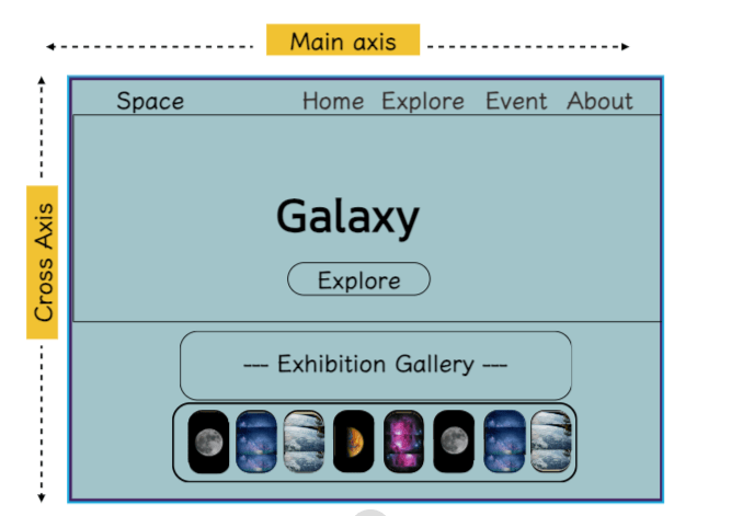
Flexbox provides powerful tools for aligning items within a container along the main and cross axes
Main axis
Cross axis
How Can We Align Items Along Main Axis?
Flexbox offers alignment options such as
justify-content to position items along the main axis
justify-content: start;
justify-content: center;
justify-content: space-between;
justify-content: space-around ;
Main axis
Space
Home
Explore
Event
About
justify-content: start;
justify-content: start;
justify-content: center;
justify-content: space-between;
justify-content: space-around ;
Main axis
Space
Home
Explore
Event
About
justify-content: center;
justify-content: start;
justify-content: center;
justify-content: space-between;
justify-content: space-around ;
justify-content: space-between;
Main axis
Space
Home
Explore
Event
About
justify-content: start;
justify-content: center;
justify-content: space-between;
justify-content: space-around ;
Main axis
Space
Home
Explore
Event
About
justify-content: space-around ;
Let's Add Other Elements
Galaxy
Explore
Lets align it further...
Cross Axis
Main axis
Space
Home
Explore
Event
About
How To Control Spacing Between Flex Items?
By using align-item property we can control the spacing between flex items along cross-axis
Cross Axis
Space
Home
Explore
Event
About
align - items: start;
align - items: center;
align - items: end;
align - items: stretch;
align - items: start;
Galaxy
Explore
Cross Axis
Space
Home
Explore
Event
About
align - items: start;
align - items: center;
align - items: end;
align - items: stretch;
align - items: center;
Galaxy
Explore
Cross Axis
Space
Home
Explore
Event
About
align - items: start;
align - items: center;
align - items: end;
align - items: stretch;
align - items: end;
Galaxy
Explore
Cross Axis
Space
Home
Explore
Event
About
align - items: start;
align - items: center;
align - items: end;
align - items: stretch;
Galaxy
Explore
How Does This Element Fit Exactly In The Middle?
Galaxy
Explore
Cross Axis
Space
Home
Explore
Event
About
align - items: center;
align - items: center;
justify-content: center;
Main axis
justify-content: center;
Galaxy
Explore
Cross Axis
Space
Home
Explore
Event
About
Main axis
Main axis

Cross Axis
Let's Add Other Elements
Space
Home
Explore
Event
About
Galaxy
Explore
Cross Axis
Main axis
Main axis
--- Exhibition Gallery ---
Lets align it further...
How Can We Align Items Along Cross Axis?
Flexbox offers alignment options such as align-content to position items along the cross axis
align - content: start;
align - content: center;
align - content: space-between;
align - content: space-around;
Space
Home
Explore
Event
About
Galaxy
Explore
Cross Axis
--- Exhibition Gallery ---
align - content: start;
align - content: start;
align - content: center;
align - content: space-between;
align - content: space-around;
Space
Home
Explore
Event
About
Galaxy
Explore
Cross Axis
--- Exhibition Gallery ---
align - content: center;
align - content: start;
align - content: center;
align - content: space-between;
align - content: space-around;
Cross Axis
align - content: center;
align - content: start;
align - content: center;
align - content: space-between;
align - content: space-around;
Cross Axis
align - content: space-between;
align - content: start;
align - content: center;
align - content: space-between;
align - content: space-around;
Cross Axis
align - content: space-around;
Adding Space Images For Exhibition Gallery
Space
Home
Explore
Event
Galaxy
Explore
Cross Axis
--- Exhibition Gallery ---
Main axis
1
2
3
4
5
6
7




How To Change The Direction Of Flex Items?
Space
Home
Explore
Event
About
Galaxy
Explore
--- Exhibition Gallery ---
Main axis
1
2
3
4
5
6
7
8
By using flex-direction properties
flex - direction: row;
flex - direction: row-reverse;
flex - direction: column;
flex - direction: column-reverse;
flex - direction: row;
Space
Home
Explore
Event
About
Galaxy
Explore
Cross Axis
--- Exhibition Gallery ---
Main axis
8
7
6
5
4
3
2
1
flex - direction: row;
flex - direction: row-reverse;
flex - direction: column;
flex - direction: column-reverse;
flex - direction: row-reverse;
Space
Home
Explore
Event
About
Galaxy
Explore
Cross Axis
--- Exhibition Gallery ---
Main axis
flex - direction: row;
flex - direction: row-reverse;
flex - direction: column;
flex - direction: column-reverse;
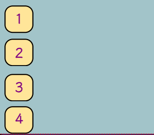
flex - direction: column;
Space
Home
Explore
Event
About
Galaxy
Explore
Cross Axis
--- Exhibition Gallery ---
Main axis
flex - direction: row;
flex - direction: row-reverse;
flex - direction: column;
flex - direction: column-reverse;
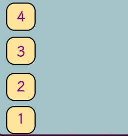
flex - direction: column-reverse;
How Does CSS Assist Websites In Adjusting
Content For Various Screen Sizes?
By using flex-wrap properties
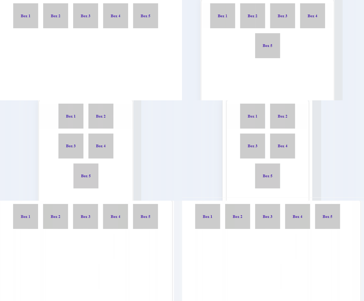
flex-wrap: wrap
Flex items wrap onto multiple lines from top to bottom if there's insufficient space on one line
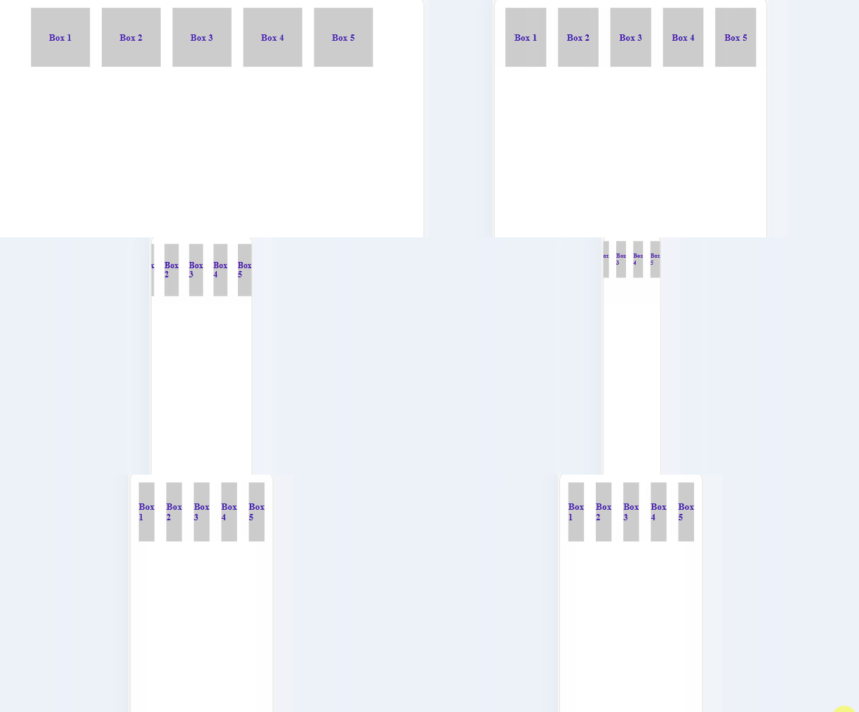
flex-wrap: nowrap
Flex items will attempt to fit on one line; if the container is too narrow, they'll overflow
Is There A Short-Hand Property For Flex Direction & Flex Wrapping?
Yes by using flex-flow property

flex-flow: row wrap;
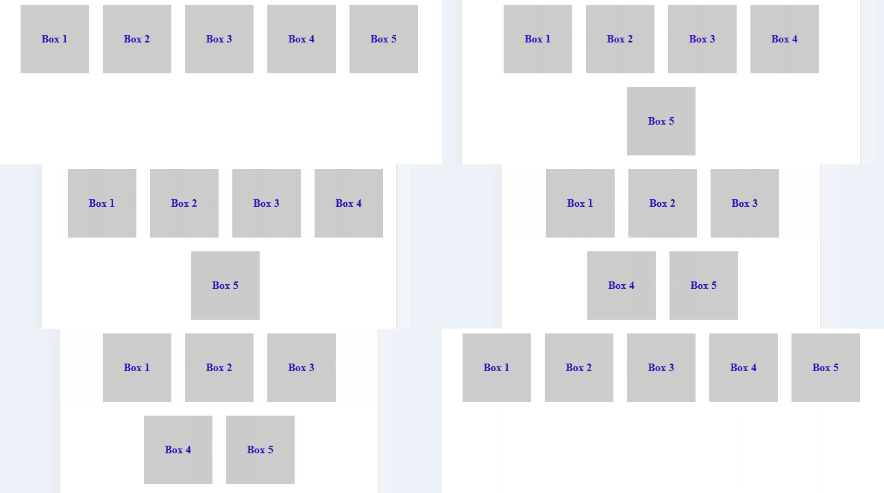
This sets the flex-direction to row & flex-wrap to wrap
Is There A Short-Hand Property For Flex Direction & Flex Wrapping?
Yes by using flex-flow property
flex-flow: row-reverse nowrap;
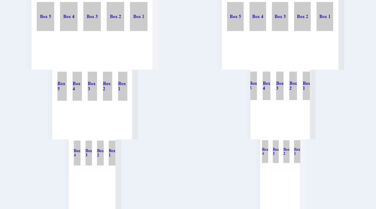
This reverses the row order with no wrapping
Now Let's Explore The Child Properties
Flex child
Flex child
But What Is A Flex Child?
Flex child is an individual items within the container that are positioned & sized based on the flex properties applied to the parent

flex child

Let's See What Are The Various Child Properties
1.
Order
3.
2.
Flex-shrink
4.
Flex-basis
5.
Align-self
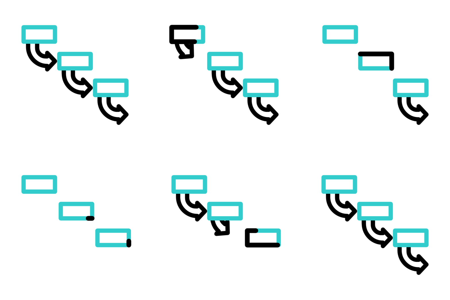


Flex-grow
How To Change The Order Of Flex Items Inside The Container?
Space
Home
Explore
Event
About
Galaxy
Explore
Cross Axis
--- Exhibition Gallery ---
Main axis
1
2
3
4
5
6
7
8

flex items
By using order property
What Is Order Property?
It allows to control the visual ordering of flex items within their flex container
1
2
3
4
5
6
7
8
0
0
0
0
0
0
0
0
Order:
Default order of all is "Zero"
Let's change the order of 2nd child to 1
2
1
Items are positioned based on ascending order values
1
2
3
4
5
6
7
8
2
Output:
0
0
0
0
0
0
0
Order:
1
What Is Flex-Grow?
`Flex-grow` allows a flex item to grow relative to other items when there is extra space

The effects are visible on hovering the child due to hover property
.flexBox:hover{
    flex-grow: 1;
}
How To Shrink An Child Element?
`Flex-shrink` allows a flex item to shrink relative to other items when there isn't enough space
The effects are visible on hovering the child due to hover property
.flexBox:hover{
    flex-shrink: 3;
}
What Is Flex-Basis?
`Flex-basis` sets the initial size of a flex item before it is adjusted by other flex properties
The effects are visible on hovering the child due to hover property
.flexBox:hover{
    flex-basis: 50%;
}
What Is Align-Self?
'Align-self' controls the alignment of a flex item along the cross axis of its parent flex container
The item is positioned at the start of the cross axis
.flexBox:hover{
  align-self: flex-start;
}
What is align-self: flex-start?
How `Align-Self` Value Aligns A Flex Item To The End?
The item is positioned at the end of the cross axis
.flexBox:hover{
  align-self: flex-end;
}
By using align-self: flex-end;
How `Align-Self` Value Aligns A Flex Item To The Center?
The item is positioned at the center of the cross axis
.flexBox:hover{
  align-self: center;
}
By using align-self: center;
You Must Have Seen Websites With Interactive Video,Right?
A video of galaxy playing on loop used as background

How To Embed Videos On Websites?
By using the `<video>` tag in HTML
<video autoplay loop muted>
    <source src= "https:/amazonaws.com/Space/galaxy1.mp4" type="video/mp4">
</video>
Defining the video tag
Video control attributes
Autoplay: Video automatically plays when pages loads
Loop: Restart the video automatically once ends
Mute: Mutes the audio of the video
Video control attributes
Specify the source of the video either in url/path
Used to specify different video formats
Different video formats:

video/webm
video/ogg
video/quicktime
Ever Wondered How Multiple Elements Of A Webpage Are Stacked?


How To Control Vertical Stacking Of Elements?
By using the `z-index` property in CSS that determines the stacking order of overlapping elements
How z-index works?
z-index: 1;
z-index: 2;
z-index: 3;
z-index: 4;
z-index: 5;
A higher z-index value places the element on top of other elements
A lower z-index value places the element behind other elements


Let's See The Final Code