


Content ITV PRO
This is Itvedant Content department
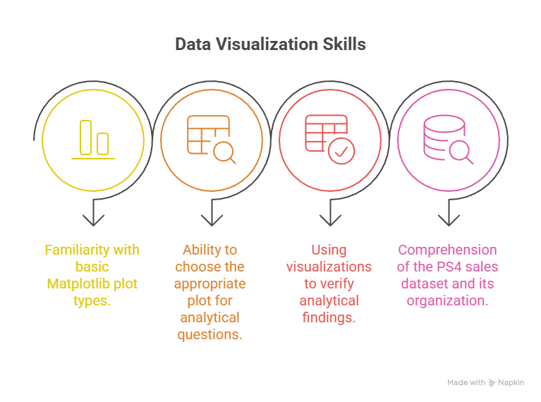
Learning Outcome
5
Create polished, insight-focused visualizations for PS4 sales analysis
4
Improve readability using labels, grids, legends, and annotations
3
Encode additional meaning using colors, markers, and sizes
2
Enhance scatter, bar, and line plots using advanced styling options
1
Explain what Matplotlib customization means and why it is necessary
Recall
Familiarity with
basic Matplotlib
plot types.
Ability to select the right plot for analytical questions.
Using visualizations to verify analytical findings
Comprehension of the PS4 sales dataset and its organizations.
The situation
On the surface, everything appears to be working as it should.
There is a chart.
The data in it is accurate.
And the message behind it is important.
So technically... everything is “right.”
The problem
But when you look at the chart
The insight really matters.
But because it doesn’t stand out visually, people don’t notice it.
So how do analysts make sure people notice what truly matters instead of getting lost in the chart?
They do it by intentionally improving the visuals:
Not changing the data.
Changing how it’s seen.
Good visuals don’t just make charts look nice.
They guide understanding.
Once a chart is correct,
customization makes sure the insight is clear, visible, and understood , not hidden in plain sight.
Matplotlib Customization
Matplotlib customization is the process of modifying visual properties , such as colors, markers, labels, sizes, and annotations , to improve interpretability and focus.
Default plots treat all data equally
Important patterns can be lost
Analytical insights require emphasis
Why customization exists
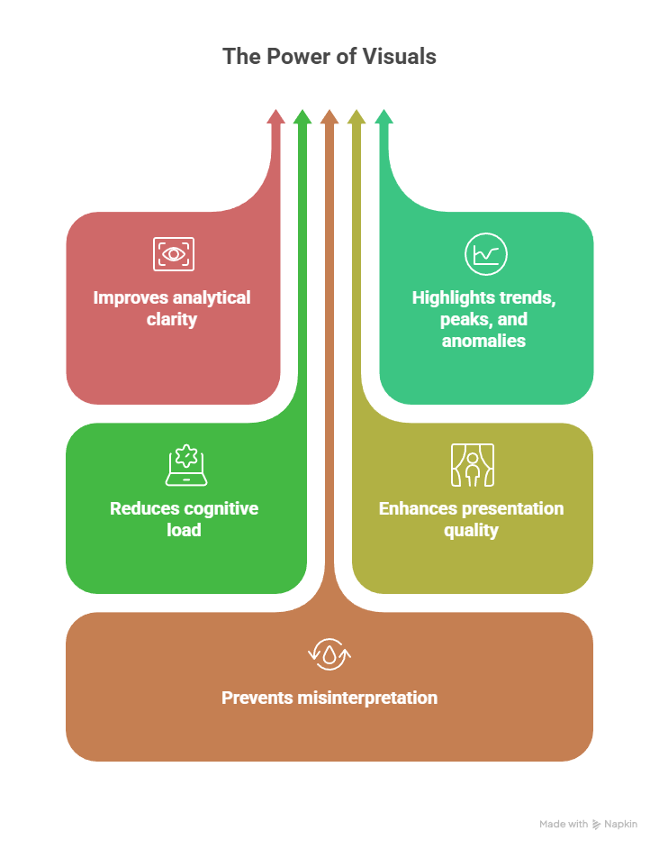
Why Visual Enhancement is Important ?
Improves analytical clarity
Highlights trends, peaks, and anomalies
Reduces cognitive load
Enhances presentation quality
Prevents misinterpretation
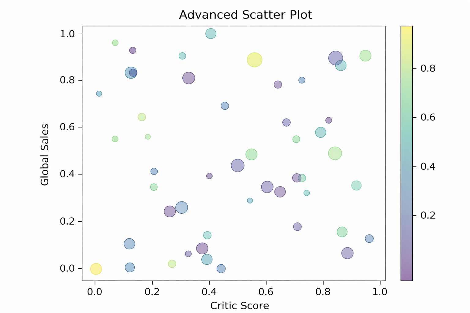
Enhancing Scatter Plots
Scatter plots often represent multiple dimensions and benefit from visual encoding.
Marker size and color can represent additional variables such as sales volume or popularity.
Customizing Marker Size and Color
PS4 Sales Context
X-axis: Critic Score
Y-axis: Global Sales
Marker size: Review count
Color: Sales intensity
import matplotlib.pyplot as plt
import numpy as np

x = np.random.rand(50)
y = np.random.rand(50)
sizes = np.random.randint(20, 200, size=50)
colors = np.random.rand(50)

plt.scatter(x, y, s=sizes,
		c=colors, alpha=0.5, cmap="viridis")
plt.title("Advanced Scatter Plot")
plt.xlabel("Critic Score")
plt.ylabel("Global Sales")
plt.colorbar()
plt.show()
CODE :
OUTPUT :
Why this works
Multiple data dimensions are conveyed without adding new axes.
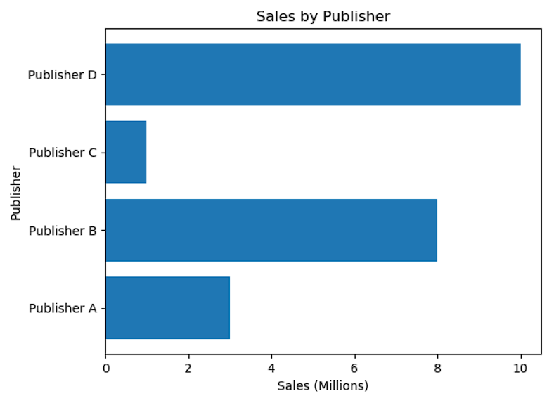
Why horizontal bars are useful
Long category names remain readable
Rankings are easier to scan
CODE :
OUTPUT :
import matplotlib.pyplot as plt
import numpy as np

categories = ["Publisher A", "Publisher B",
"Publisher C", "Publisher D"]
values = [3, 8, 1, 10]

plt.barh(categories, values)
plt.title("Sales by Publisher")
plt.xlabel("Sales (Millions)")
plt.ylabel("Publisher")
plt.show()
They are intuitive and effective for category comparison.
Why vertical bars matter ?
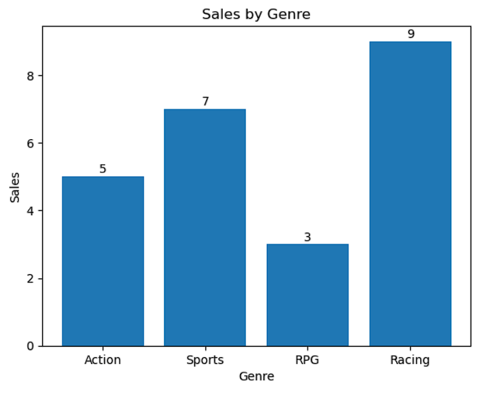
Adding Value Labels to Bars
Displaying exact values removes ambiguity.
categories = ["Action", "Sports", "RPG", "Racing"]
values = [5, 7, 3, 9]

plt.bar(categories, values)
plt.title("Sales by Genre")
plt.xlabel("Genre")
plt.ylabel("Sales")

for i in range(len(values)):
    plt.text(i, values[i] + 0.1, values[i], ha="center")

plt.show()
CODE :
range(len(values)) generates bar positions
values[i] accesses bar height
plt.text() places the value above each bar
OUTPUT :
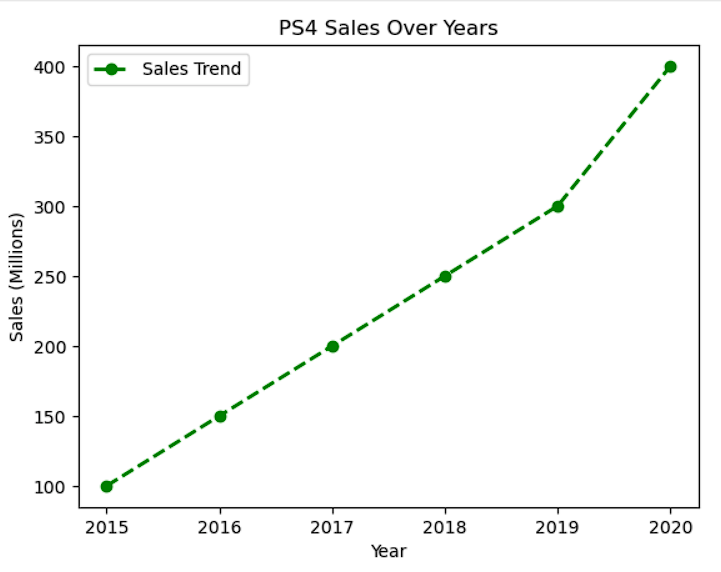
Customizing Line Plots
Line plots represent trends and benefit from styling.
years = [2015, 2016, 2017, 2018, 2019, 2020]
sales = [100, 150, 200, 250, 300, 400]

plt.plot(
    years,
    sales,
    marker="o",
    linestyle="--",
    color="green",
    linewidth=2,
    label="Sales Trend"
)

plt.xlabel("Year")
plt.ylabel("Sales (Millions)")
plt.title("PS4 Sales Over Years")
plt.legend()
plt.show()
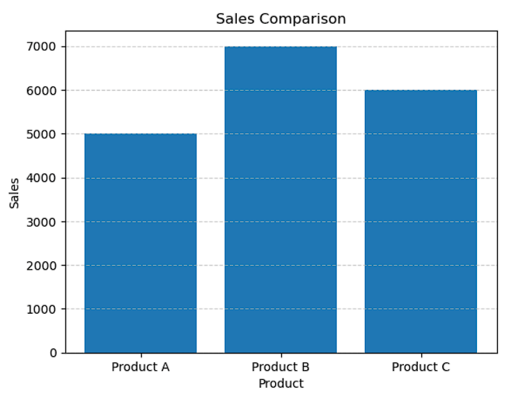
Why grids help ?
They improve value estimation and alignment.
products = ["Product A",
"Product B", "Product C"]
sales = [5000, 7000, 6000]

plt.bar(products, sales)
plt.grid(axis="y", linestyle="--",
alpha=0.7)
plt.xlabel("Product")
plt.ylabel("Sales")
plt.title("Sales Comparison")
plt.show()
Adjusting Figure Size and Font Styles
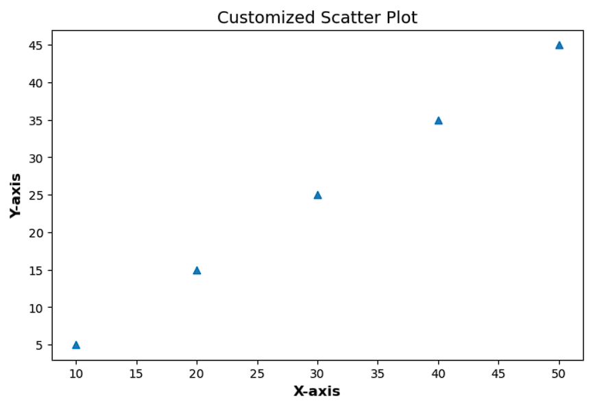
Ensures readability across screens and reports.
Purpose
plt.figure(figsize=(8, 5))
x = [10, 20, 30, 40, 50]
y = [5, 15, 25, 35, 45]
plt.scatter(x, y, marker="^")
plt.xlabel("X-axis", fontsize=12,
fontweight="bold")
plt.ylabel("Y-axis", fontsize=12,
fontweight="bold")
plt.title("Customized Scatter Plot",
fontsize=14)
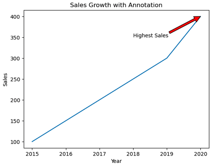
plt.show()Adding Annotations to Highlight Key Points
Annotations explicitly draw attention to important insights.
years = [2015, 2016, 2017, 2018, 2019, 2020]
sales = [100, 150, 200, 250, 300, 400]

plt.plot(years, sales)

plt.annotate(
    "Highest Sales",
    xy=(2020, 400),
    xytext=(2018, 350),
    arrowprops=dict(facecolor="red")
)

plt.xlabel("Year")
plt.ylabel("Sales")
plt.title("Sales Growth with Annotation")
plt.show()
Saving High-Quality Visuals
Ensures visuals are publication-ready.
plt.savefig("ps4_sales_plot.png", dpi=300)<Figure size 640x480 with 0 Axes>
Summary
4
Matplotlib enables professional-quality visuals
3
Annotations and styling highlight insights
2
Visual enhancements guide interpretation
1
Customization improves clarity and emphasis
Quiz
Why are annotations useful in visualization?
A. Reduce data size
B. Improve file saving
C. Highlight key insights
D. Change plot type
Quiz-Answer
Why are annotations useful in visualization?
A. Reduce data size
B. Improve file saving
C. Highlight key insights
D. Change plot type
By Content ITV


