A Bootstrap Journey

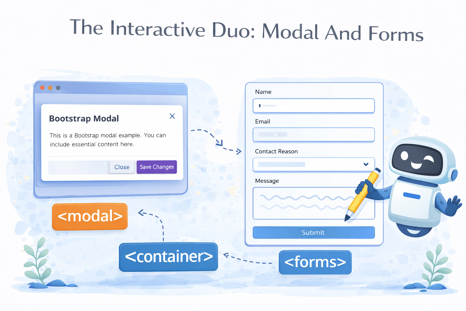
The Interactive Duo: Modal And Forms

Learning Outcome
A popup overlaying the current page for interactions
A structured input area for collecting user data
A clickable element for user interaction
What Is Bootstrap Grid?
The Bootstrap grid system is a 12-column layout system that helps create responsive web designs, adapting automatically to different screen sizes
1
2
3
4
5
6
7
8
9
10
11
12
6
6
2
2
2
2
2
2
8
4
How Bootstrap Grid Works?
Bootstrap's grid system uses containers to wrap content, rows for horizontal groups of columns, and flexible, responsive columns
1
2
3
4
5
6
7
8
9
10
11
12
6
6
2
2
2
2
2
2
8
4
Container
Columns
Rows
Bootstrap's grid system uses containers to wrap content, rows for horizontal groups of columns, and flexible, responsive columns
<div class="container">
  <div class="row">
    <div class="col">Column 1</div>
    <div class="col">Column 2</div>
    <div class="col">Column 3</div>
  </div>
</div>
<div class="container">
Provides a responsive fixed-width or fluid-width layout to ensure proper alignment and padding for the content within
<div class="row">
Rows control column alignment and spacing, organizing columns horizontally within a container while managing their responsive behavior
    <div class="col">Column 1</div>
    <div class="col">Column 2</div>
    <div class="col">Column 3</div>
Columns (`col`) manage column widths within rows, adjusting responsively for readability and organization across screens
How Bootstrap Grid Works?
Now What is A Container?
A container in Bootstrap wraps and aligns content, ensuring it's responsive
.container
.row
.col
.col
What Are Types of Container?


.container
.container-fluid
.container-{breakpoint}
What is .container?
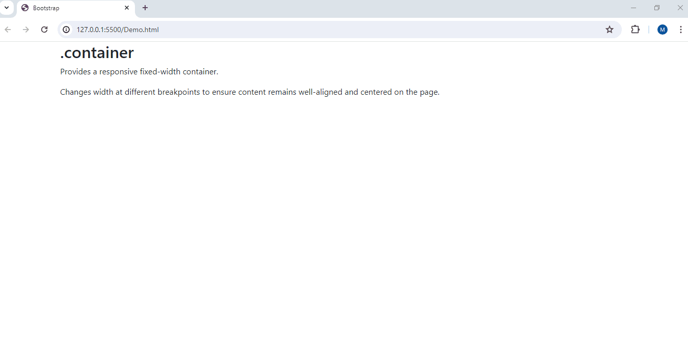
When the browser window is resized, the .container changes its width to adapt to the new screen size
This ensures that the content inside the container remains centered and does not stretch too wide on large screens or become too narrow on small screens
What is .container-fluid?
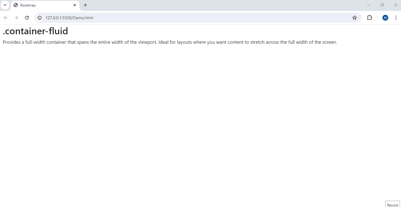
As the browser window is resized, the .container-fluid continues to span the full width of the window, adjusting its content accordingly
This ensures that the content inside the container always occupies the entire width of the screen, providing a fluid and seamless layout
What is .container-{breakpoint}?
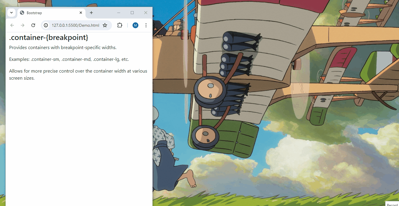
As the browser window is resized, the container changes its width at different breakpoints
This ensures the content inside the container adjusts its size appropriately at each breakpoint
But What is Breakpoint?
A breakpoint is a predefined screen width where the layout of a website changes.
This could involve resizing elements, rearranging content, or applying different styles


xs
sm
lg
xxl
md
xl
Extra Small
Small
Extra Large
Extra extra large
Large
Medium
<576px
≥576px
≥768px
≥992px
≥1200px
≥1400px
How Can We Display Content in a Grid Layout?

Using Bootstrap Cards
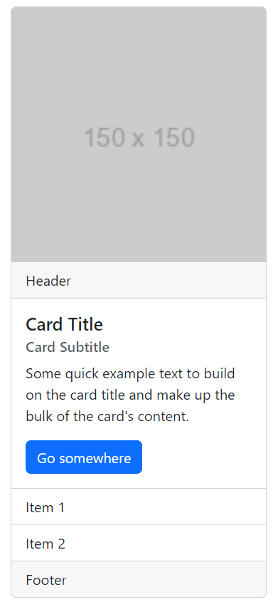
What is a Bootstrap Card?
A Bootstrap card is a flexible content container that can hold text, images, links, and more. It helps create visually appealing and structured content blocks easily.
<h5 class="card-title">Card Title</h5>
<h6 class="card-subtitle mb-2 text-muted">
Card Subtitle</h6>
<p class="card-text">Some quick example..</p>
<a href="#" class="btn btn-primary">Go somewhere</a>
<div class="card " style="width: 18rem;">
<img src="https://via.placeholder.com/150" class="card-img-top" alt="Card image">
<div class="card-header">Header</div>
<div class="card-body">
</div>
<ul class="list-group list-group-flush">
<li class="list-group-item">Item 1</li>
<li class="list-group-item">Item 2</li>
</ul>
<div class="card-footer">Footer</div>
How Can We Navigate Through Multiple Pages of Content Efficiently on a Website?
Using Pagination
What is Pagination?
Pagination in Bootstrap is a component that divides content into separate pages, making large datasets easier to navigate and improving performance
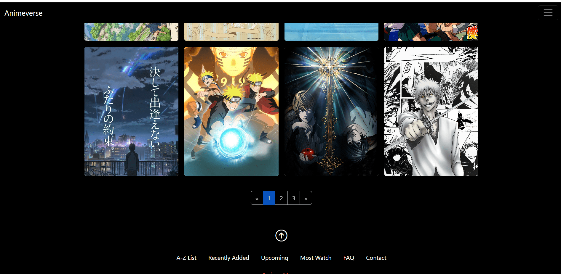
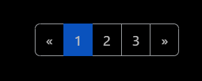
How Pagination Works?
The basic pagination structure includes a navigation element with a list of page items that users can click to move between different pages of content
Previous
1
2
3
Next
<nav aria-label="Page navigation example">
  <ul class="pagination">
    <li class="page-item"><a class="page-link" href="#">Previous</a></li>
    <li class="page-item"><a class="page-link" href="#">1</a></li>
    <li class="page-item"><a class="page-link" href="#">2</a></li>
    <li class="page-item"><a class="page-link" href="#">3</a></li>
    <li class="page-item"><a class="page-link" href="#">Next</a></li>
  </ul>
</nav>
Pagination in Bootstrap is a component that divides content into separate pages, making large datasets easier to navigate and improving performance
<nav aria-label="Page navigation example">
<ul class="pagination">
<!-- Disabled previous button -->
<li class="page-item disabled"><a class="page-link" href="#">Previous</a></li>
<!-- Active page number -->
<li class="page-item active"><a class="page-link" href="#">1</a></li>
<li class="page-item"><a class="page-link" href="#">2</a></li>
<li class="page-item"><a class="page-link" href="#">3</a></li>
<!-- Next button -->
<li class="page-item"><a class="page-link" href="#">Next</a></li>
</ul>
</nav>
Previous
1
2
3
Next