


Content ITV PRO
This is Itvedant Content department
Learning Outcome
6
Basics of branding and messaging
5
Target audience and segmentation
4
Different marketing channels
3
Understand the structure and meaning of the Mumbai West house pricing dataset
2
Install and configure Seaborn correctly
1
Explain what Seaborn is and why it is used
Previously covered topics :
DataFrames and Series
Data preparation and inspection
Cleaning and transforming data before analysis
Analytical validation before visualization
Visualization using Matplotlib
A Data analyst is preparing a report for stakeholders...
You calculate values yourself
Decide every label and color
Adjust spacing manually
Redo work when data changes
By using Matplotlib, It’s like drawing charts on a blank sheet:
The analysis is correct, but most of your time goes into building the chart, not reading the data
Now imagine using a ready-made professional template:
It understands your data tables
Highlights trends automatically
Compares categories clearly
Keeps visuals consistent
You focus on insights, not chart mechanics
What did we use in this case
Seaborn builds on these concepts by reducing plotting effort while adding statistical intelligence
In that scenario Seaborn was used
Matplotlib → manual control, more effort
Seaborn → insight-first visualization
When the goal is to explain patterns clearly,
Seaborn makes visuals easier, faster, and more meaningful
Let's understand it in detail....
What is Seaborn
Definition
Seaborn is a Python visualization library built on Matplotlib that offers high-level, statistically informed plots for pandas DataFrames.
Why Seaborn exist?
Matplotlib requires extensive manual configuration
Statistical plots require additional logic
DataFrame-based workflows need native support
Installing and Setting Up Seaborn
Explanation:
sns → Seaborn plotting interface
plt → rendering and fine control
Installation
pip install seabornImports
import seaborn as sns
import matplotlib.pyplot as plt
import pandas as pd
Understanding the Mumbai West House Pricing Dataset
This dataset represents Mumbai western-region housing listings for price analysis
Key Columns:
bhk – number of bedrooms, halls, kitchens
type – apartment, villa, independent house, studio apartment
locality – neighborhood information
area – size in square feet
price – numeric price value
price_unit – L (Lakh) or Cr (Crore)
status – ready to move / under construction
age – new, resale, unknown
region – geographic region
Why Use Seaborn Over Matplotlib?
Seaborn is preferred when the goal is to visualize patterns and distributions, not manually assemble plots
Key advantages
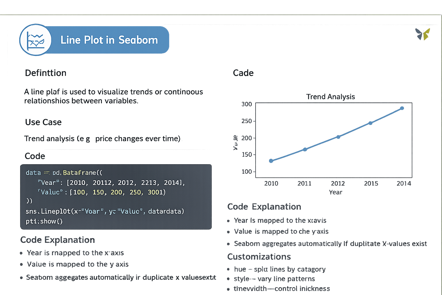
Line Plot in Seaborn
A line plot is used to visualize trends or continuous relationships between variables.
data = pd.DataFrame({
    "Year": [2010, 2011, 2012, 2013, 2014],
    "Value": [100, 150, 200, 250, 300]
})

sns.lineplot(x="Year", y="Value", data=data)
plt.show()
Year is mapped to the x-axis
Value is mapped to the y-axis
Seaborn aggregates automatically if duplicate x-values exist
Code Explanation:
Code:
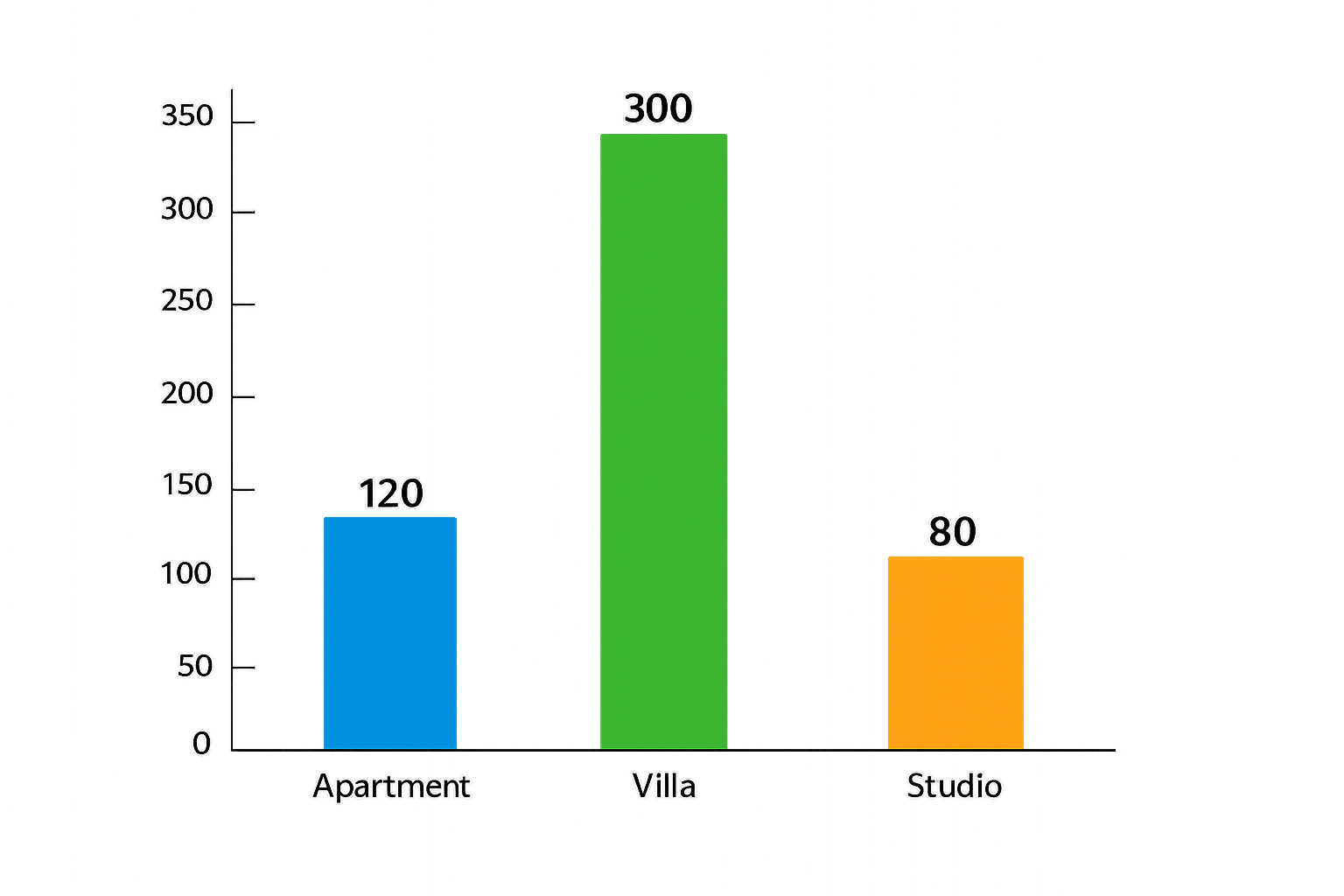
Bar Plot in Seaborn
A bar plot compares aggregated numerical values across categories
Code:
data = pd.DataFrame({
    "Category": ["Apartment", "Villa", "Studio"],
    "Values": [120, 300, 80]
})

sns.barplot(x="Category", y="Values", data=data)
plt.show()
Seaborn computes the mean for each category
Bars represent aggregated statistics
Code Explanation:
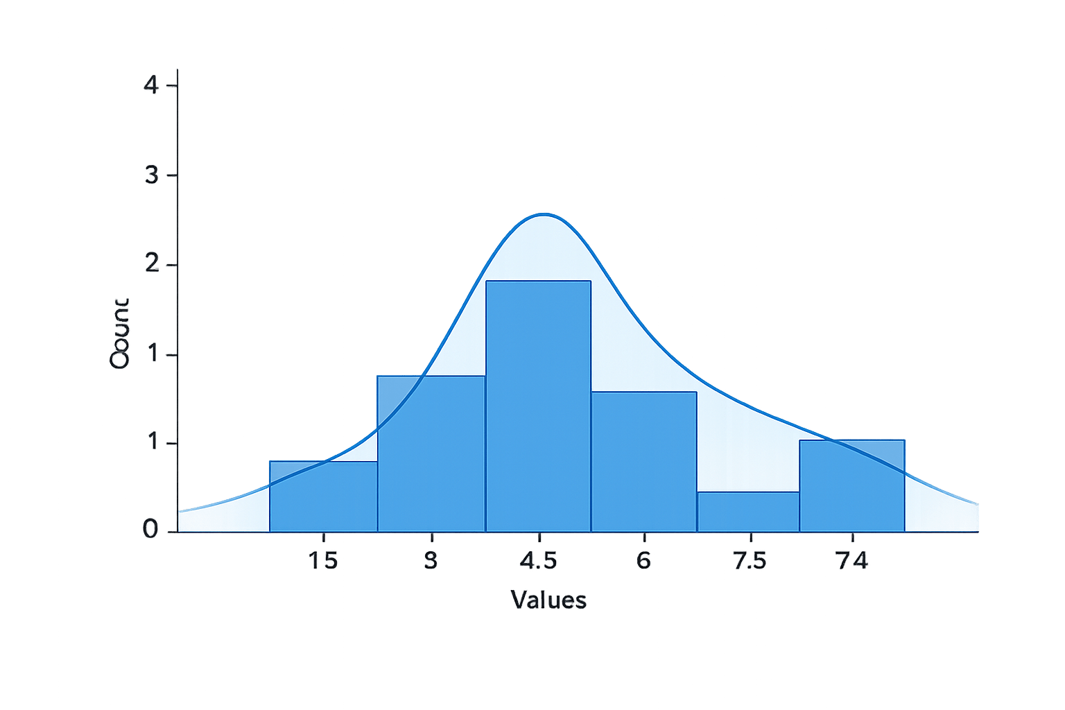
Histogram in Seaborn
A histogram shows the distribution of a single continuous variable
Code:
data = pd.DataFrame({
    "Values": [1, 2, 2, 3, 4, 4, 5, 6, 7, 8, 9]
})

sns.histplot(data["Values"], bins=5, kde=True)
plt.show()
Code Explanation:
Values are grouped into bins
Bar height shows frequency
KDE curve shows distribution shape
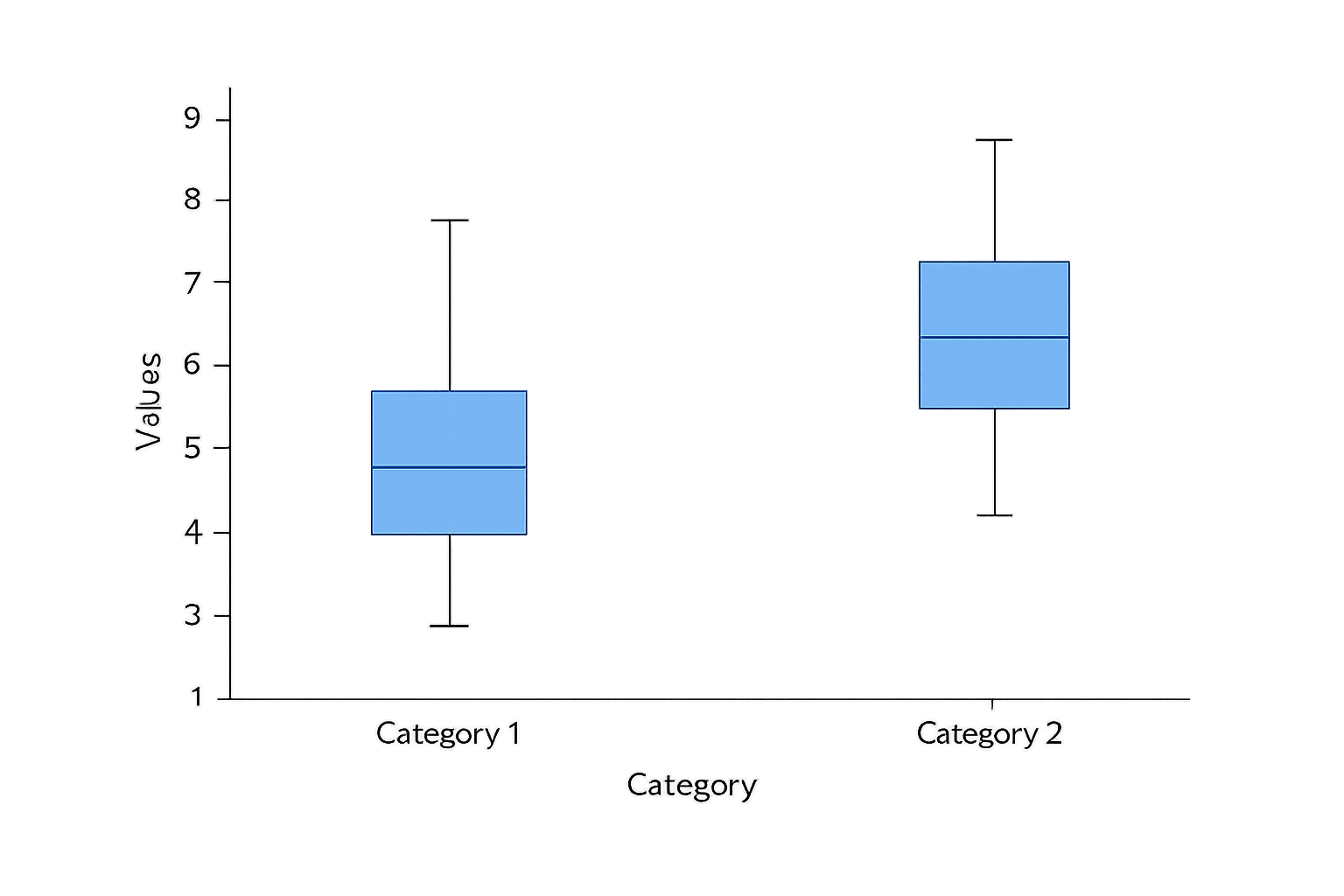
Box Plot in Seaborn
A box plot summarizes data using quartiles and highlights potential outliers
Code:
data = pd.DataFrame({
    "Type": ["Apartment", "Apartment", "Villa", "Villa"],
    "Price": [100, 120, 300, 280]
})

sns.boxplot(x="Type", y="Price", data=data)
plt.show()
Code Explanation:
Box shows interquartile range
Line inside box shows median
Points beyond whiskers indicate outliers
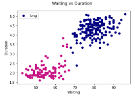
Scatter Plot in Seaborn
A scatter plot visualizes the relationship between two continuous variables
Code:
data = pd.DataFrame({
    "Area": [400, 600, 800, 1000, 1200],
    "Price": [50, 90, 150, 220, 300]
})

sns.scatterplot(x="Area", y="Price", data=data)
plt.show()
Code Explanation:
Each point represents one house
Position reflects area–price relationship
Summary
4
Customization enhances clarity and interpretation
3
Each plot type serves a specific analytical purpose
2
Works directly with pandas DataFrames
1
Seaborn simplifies statistical visualization
Quiz
Which Seaborn plot is best for identifying outliers across house types?
A. Line plot
B. Histogram
C. Box plot
D. Scatter plot
Quiz-Answer
Which Seaborn plot is best for identifying outliers across house types?
A. Line plot
B. Histogram
C. Box plot
D. Scatter plot
By Content ITV


