From Interaction to Experience
From Interaction to Experience
- Why do some digital experiences feel effortless?
- Why do some interactions feel frustrating?
- Why does motion matter?
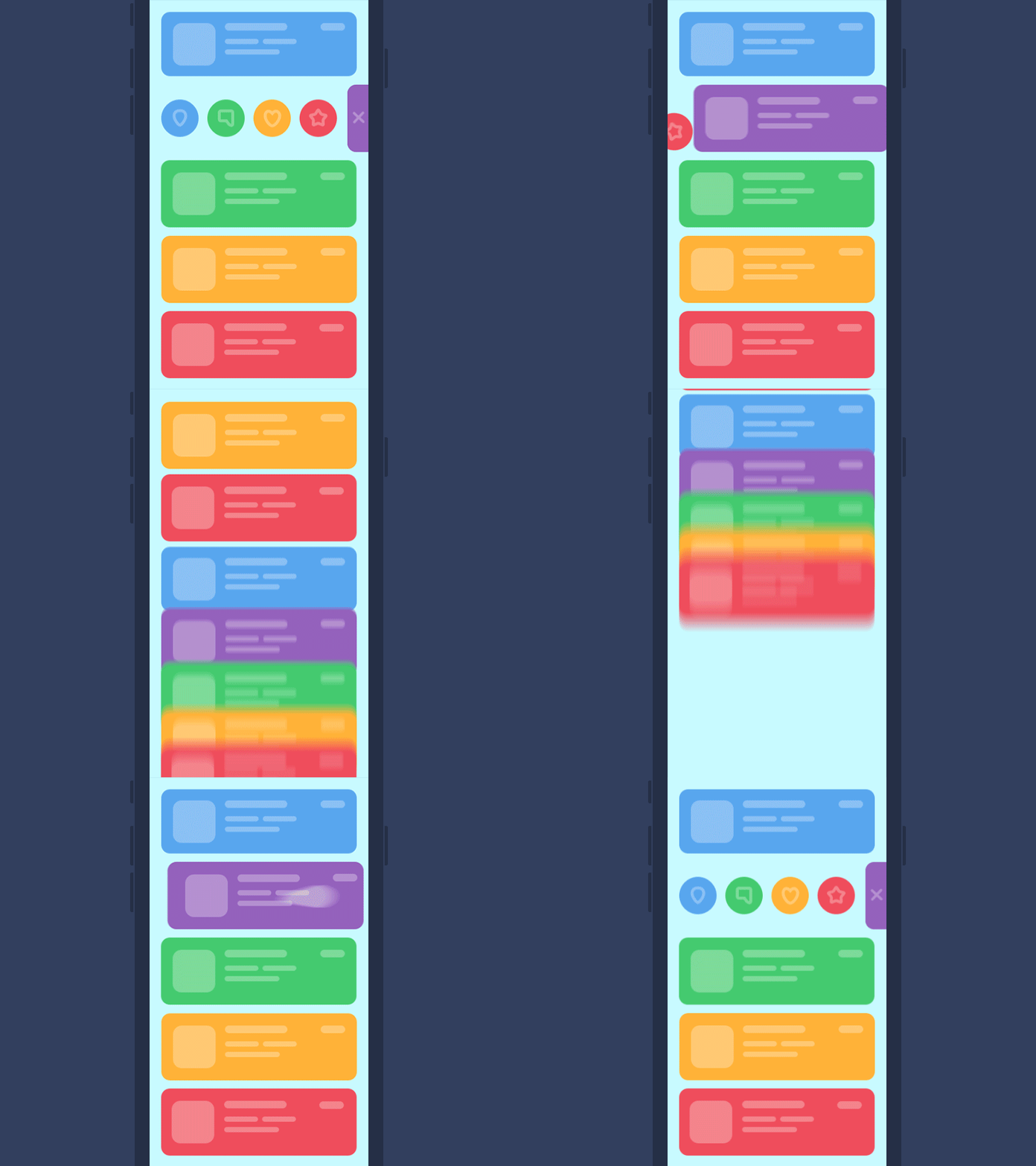

Today's Goals
- Explain and experience the role of feedback in interactive systems
- Distinguish between usability and delight
- Analyze digital experiences using interaction design terminology
- Evaluate whether motion improves or harms an experience
- Defend design decisions with evidence and theory
Overview
Part 1
- Emotional Design
- Norman's Three Levels
Part 2
- Psychology of Interaction
- Cognitive Load
- Affordances
- Feedback
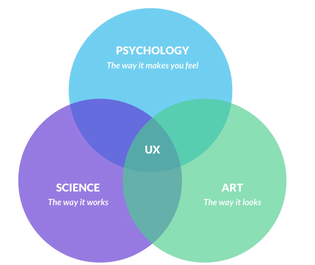
Part 3
- Motion Analysis
- Functional Motion
Part 4
- Redesign Challenge
Part 5
- Critique & Reflection
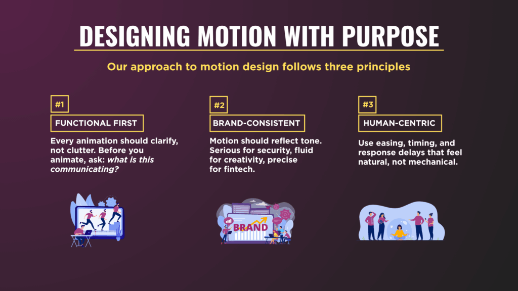
Experiences matter.
— Interactive Media Production
Why do people prefer some digital products?
- Faster?
- Easier?
- More beautiful?
- More useful?
- More memorable?
Design ≠ Visual Design
Experience = User + Interface + Context + Interaction + Perception + Emotion
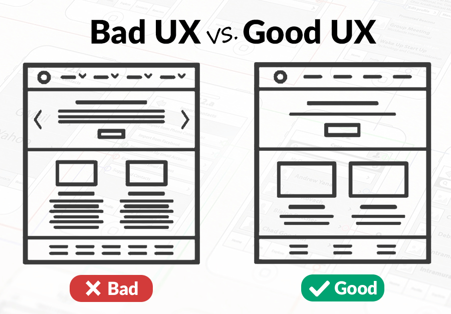
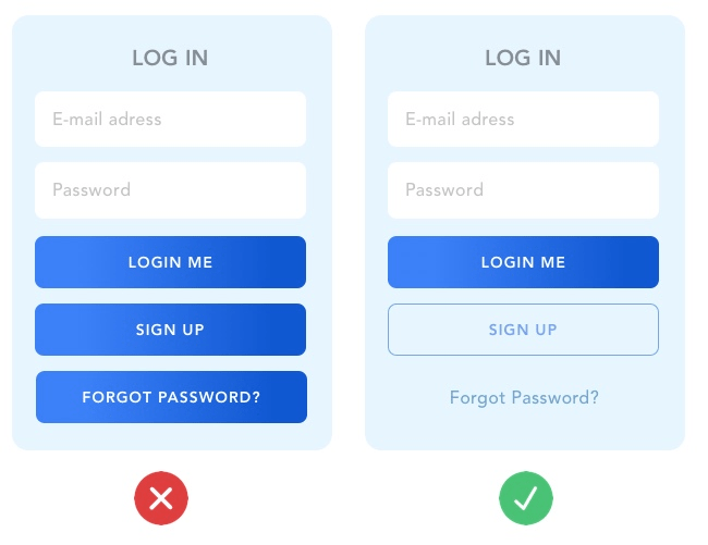
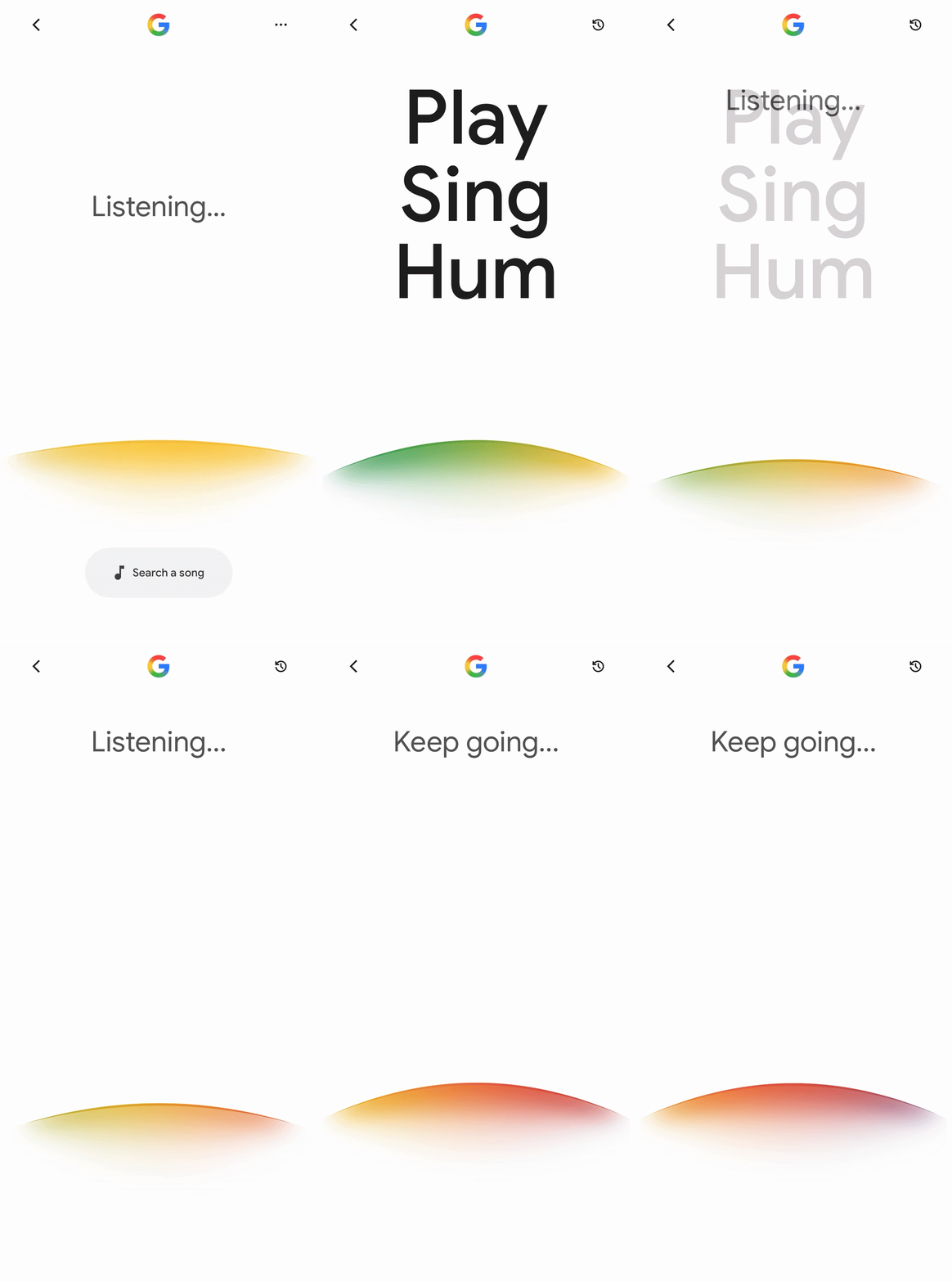
Beyond aesthetics
Good Design
- Useful
- Understandable
- Efficient
- Memorable
Great Design
- Emotional
- Meaningful
- Delightful
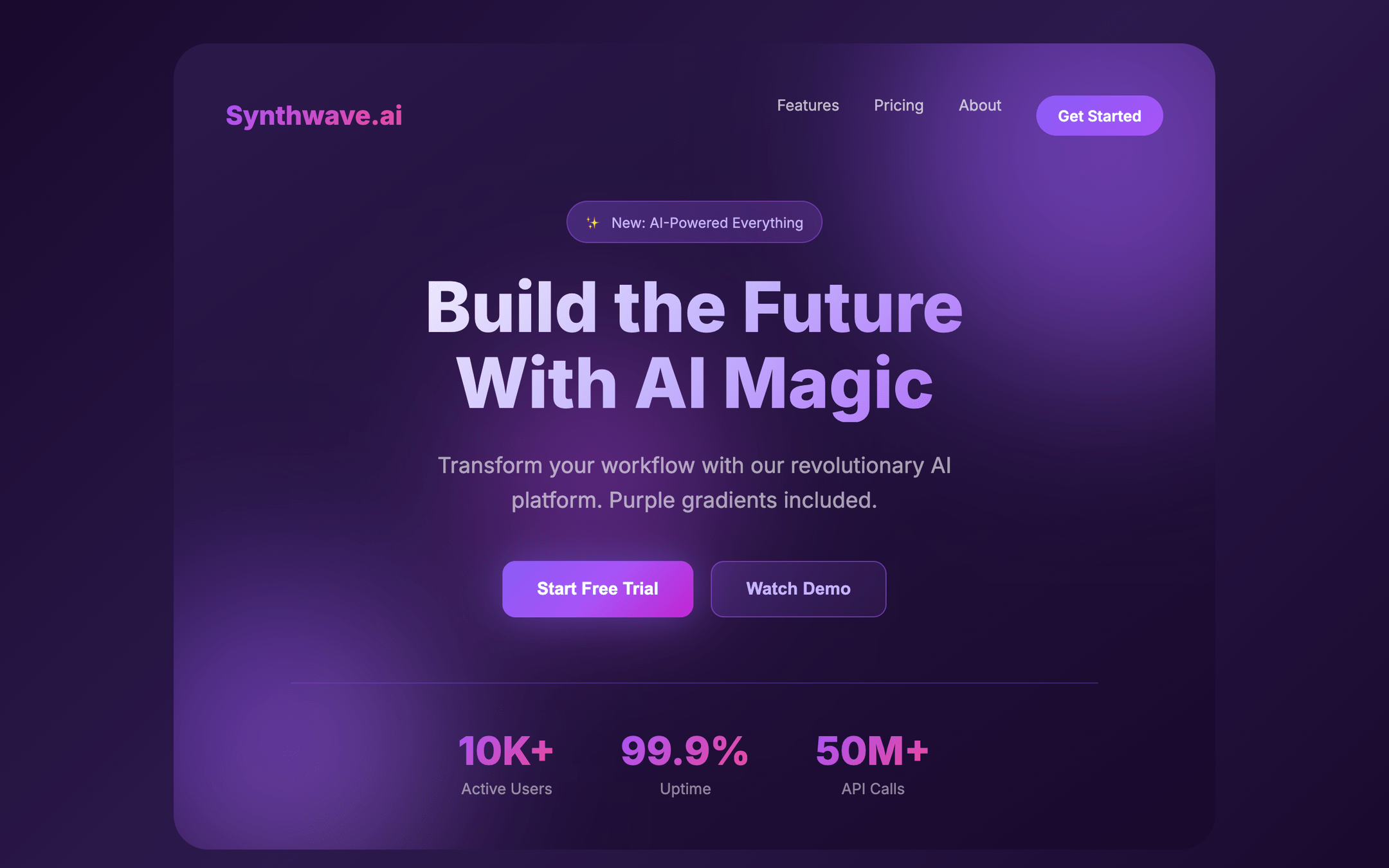
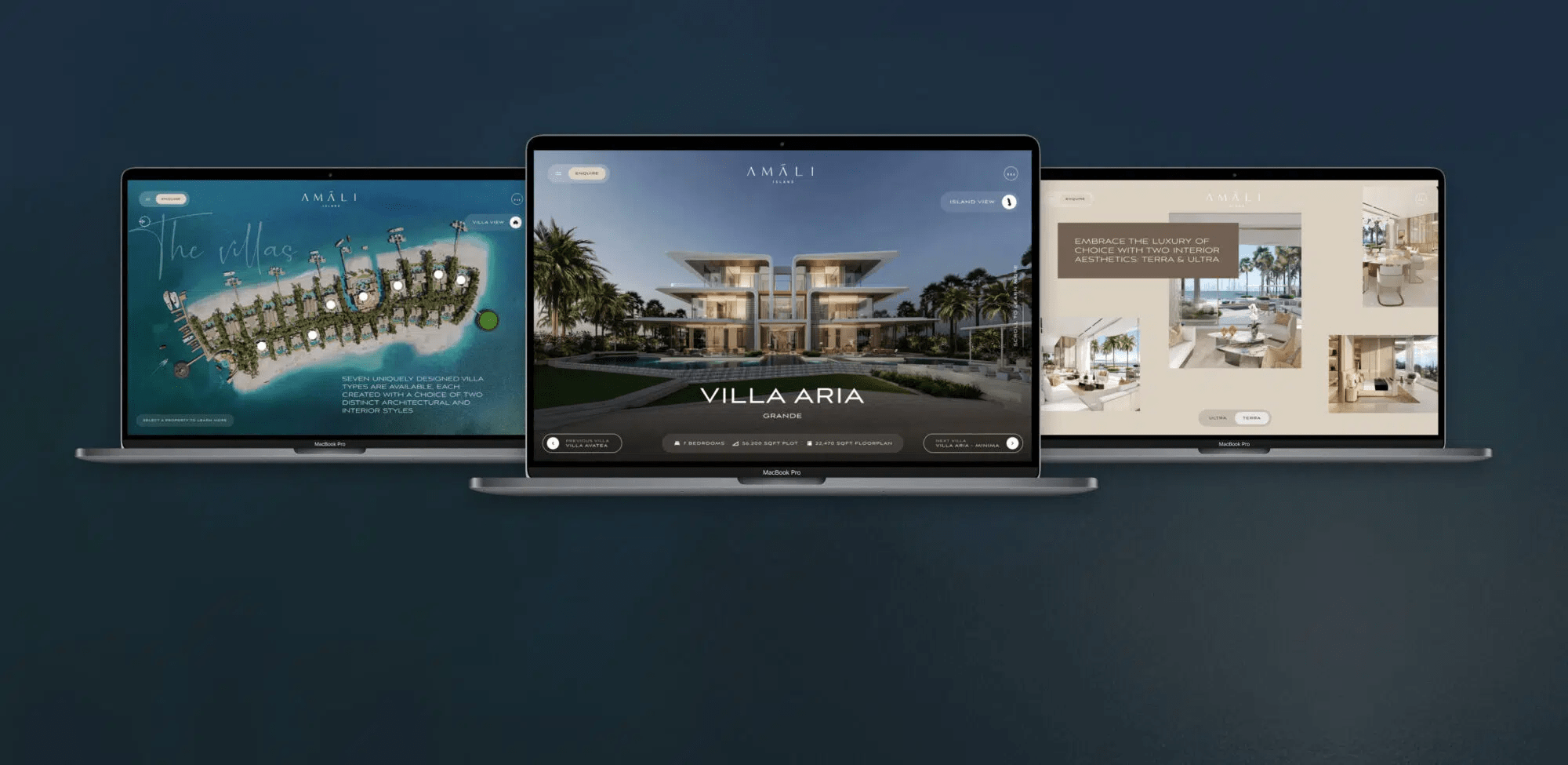
Levels of design
— Interactive Media Production
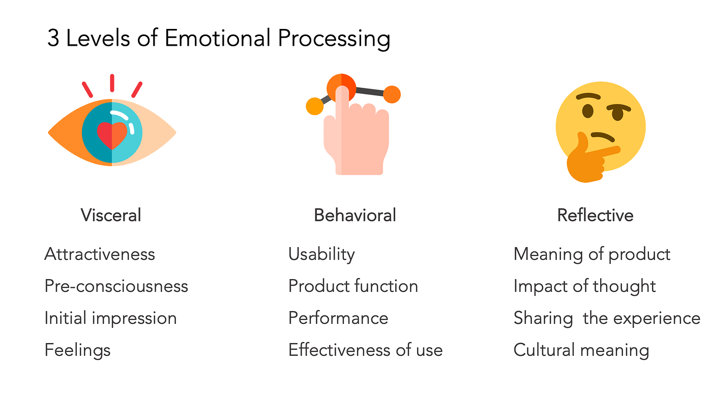
Three Levels of Design - Don Norman
- Visceral
- Behavioral
- Reflective
Different layers →
Different effects
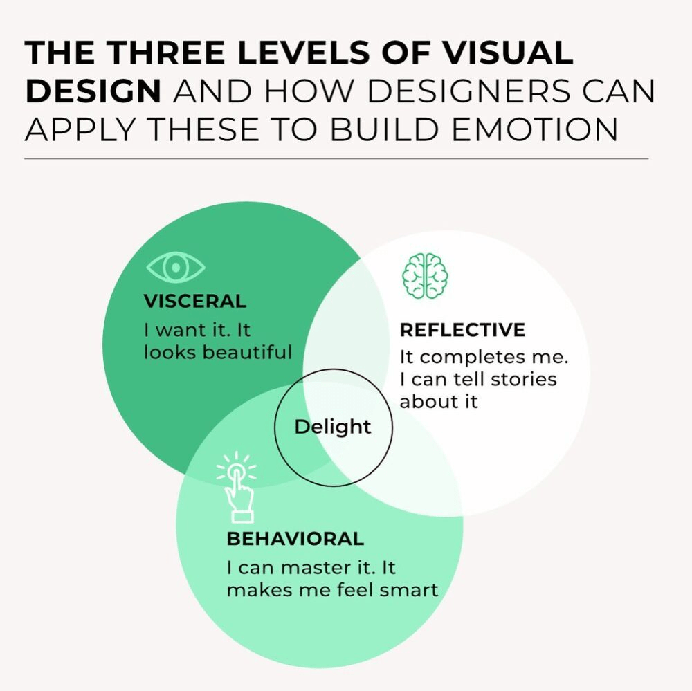
Visceral Design
First Impression
- Look
- Feel
- Emotion
Questions to ask yourself?
- Attractive?
- Modern?
- Trustworthy?
- Exciting?
- ...
Visceral Design: Examples
- Apple
- Stripe
- Airbnb
- ...

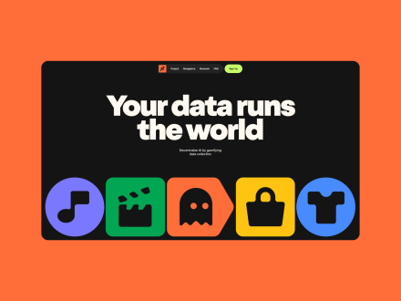



Visceral Design: Examples?
Find a website that triggers a visceral reaction!
Behavioral Design
During your visit:
- Clarity
- Understanding
- Feedback
- Efficiency
Questions to ask yourself?
- Easy?
- Predictable?
- Fast?
- ...
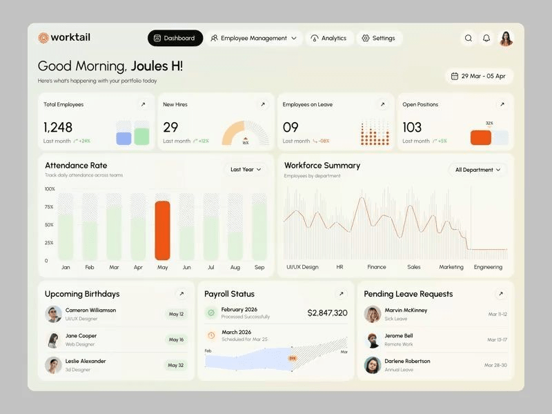
Behavioral Design: Examples?
What experiences can you find?
Behavioral Design: Examples
- Booking.com
- Notion
- iBood
- ....

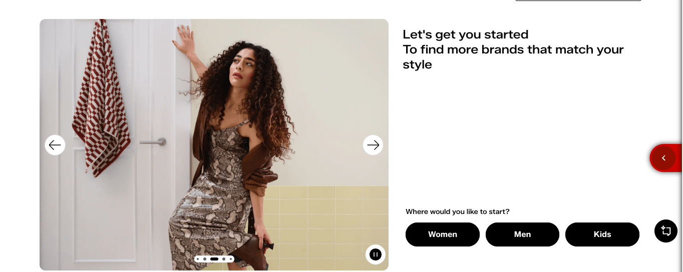
Reflective Design
After Use
- Memory
- Identity
- Meaning
Questions to ask yourself?
- Worth remembering?
- Worth sharing?
- Worth returning?
Reflective Design Examples?
What experiences did you share or remember recently?
Reflective Design Examples
- Spotify Wrapped
- Duolingo Streaks
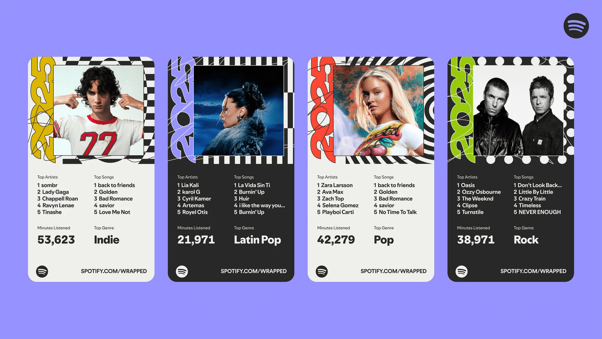
Exercise
3-Level Analysis
Analyze
- First impression
- Ease of use
- Long-term value
Discussion
- Strongest level?
- Weakest level?
reddit.com


wikipedia.org


fontshare.com
Psychology & interaction
— Interactive Media Production
From Design to Psychology
What happens in the user's mind?
- Attention (Cognition)
- Perception (Feedback)
- Decision making (Affordance)
- Memory (Retention)
Interaction = Human Behavior

Why do some dashboards feel overwhelming?
Cognition
Attention: Cognitive Load
Mental Effort
- Processing information
- Remembering information
- Making choices
Brain is a limited resource, attention is finite.
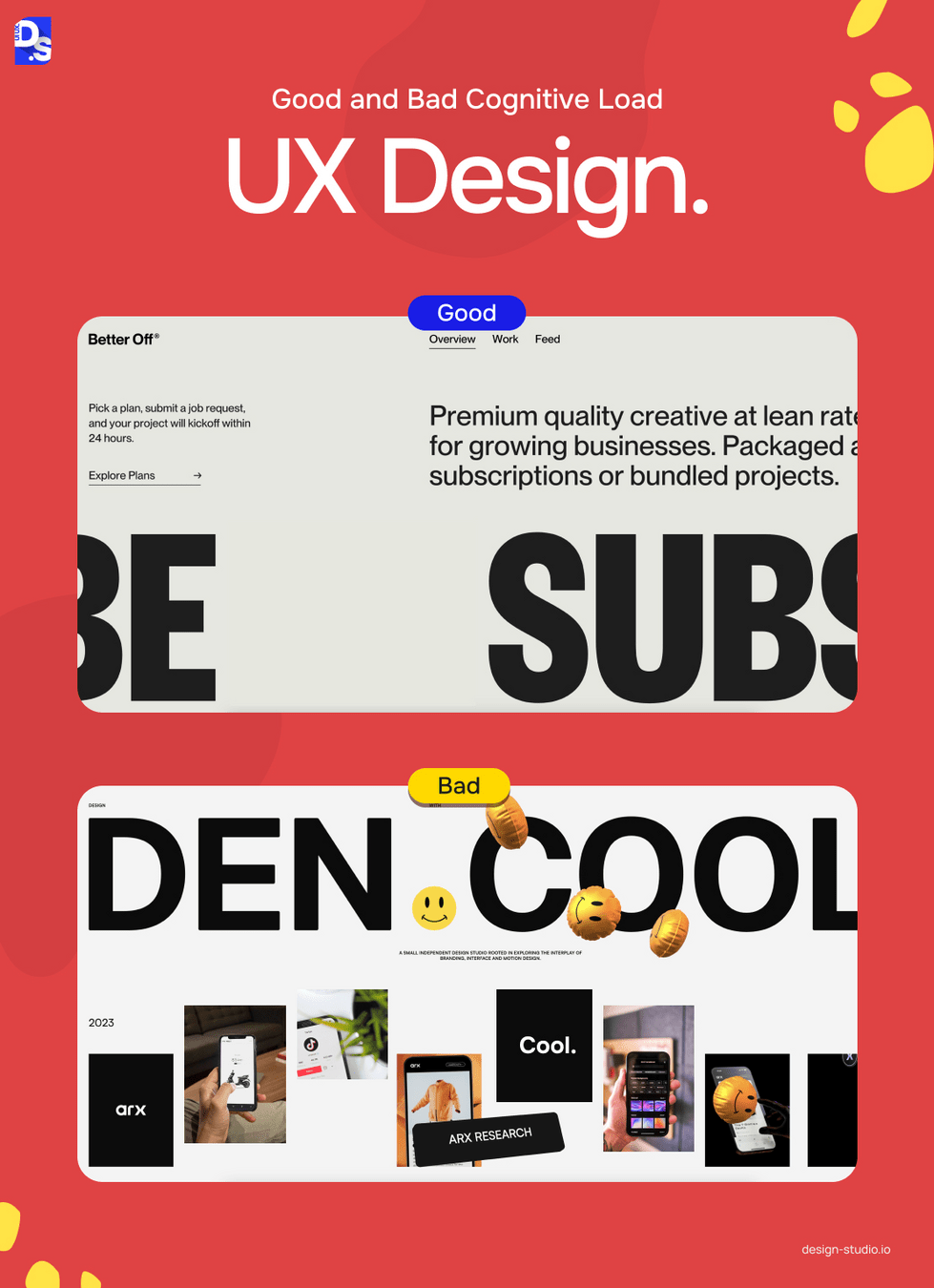
Sources of Cognitive Load?
Visual
- Clutter
- Noise
- Too many colors
Structural
- Complex navigation
- Too many options
Motion
- Excessive animation
- Competing movement
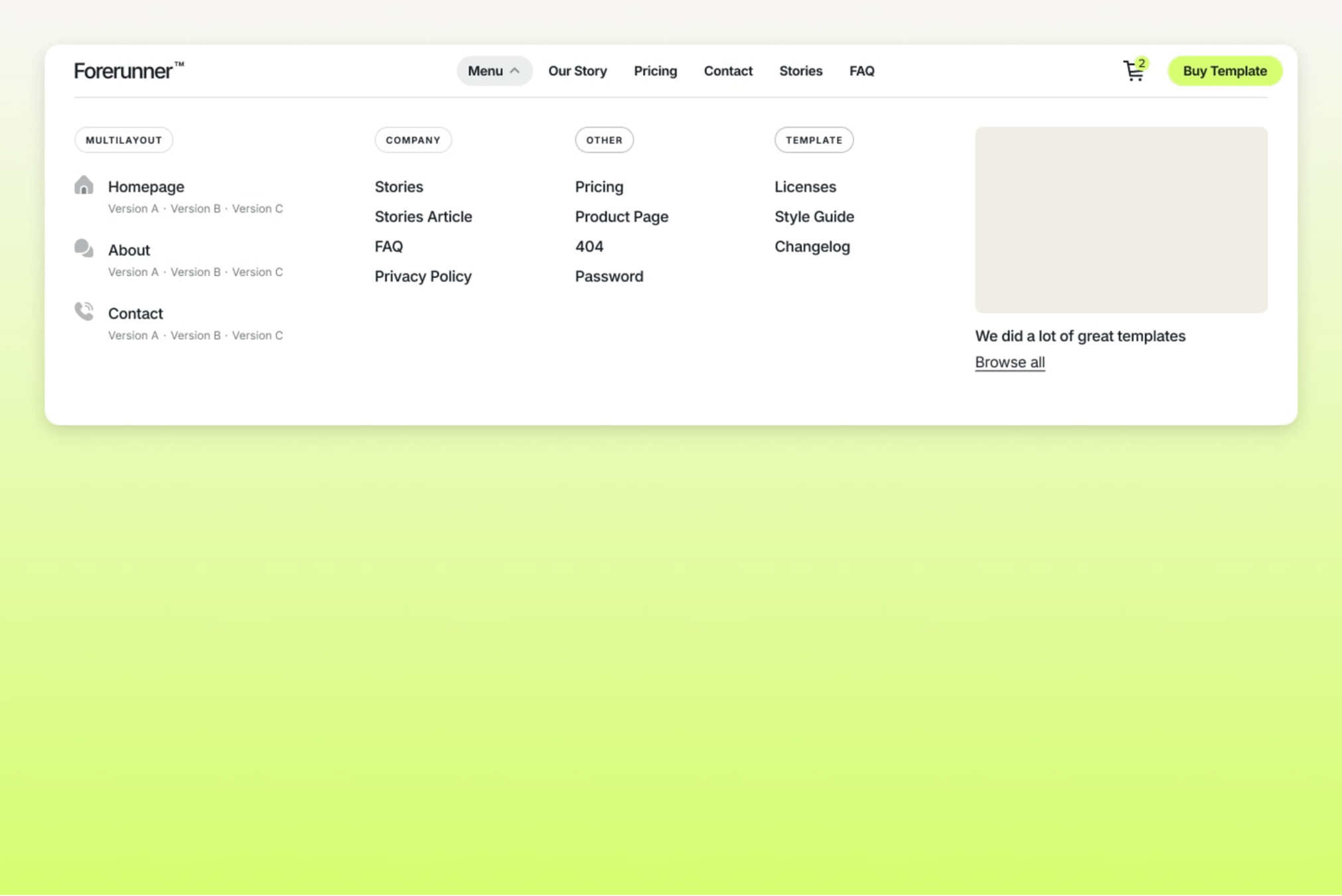
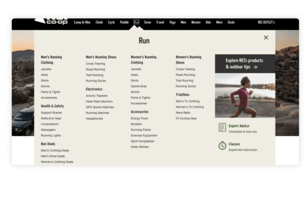
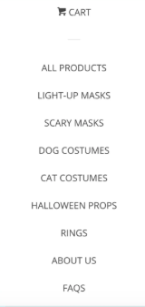
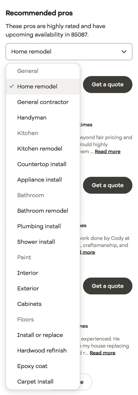
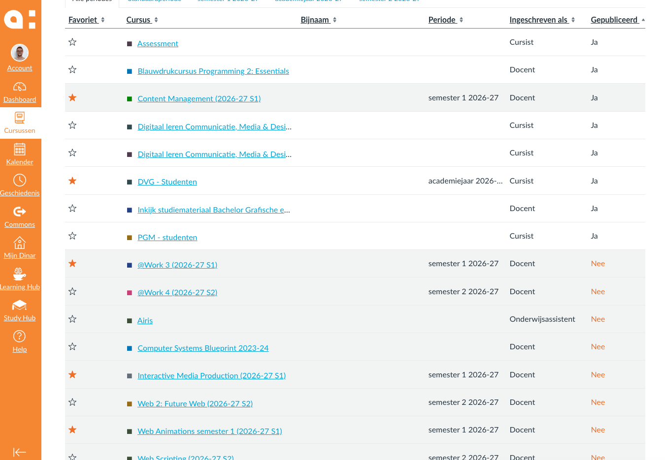
Choice Overload
More options ≠ Better
Problems:
- Indecision
- Friction
- Abandonment
Design Goal:
Reduce unnecessary decisions.
Where have you experienced overload?
Examples:
- University portals
- Government websites
- E-commerce platforms
Perception
Perception: Feedback Loops
How should user percieve your UI?
Without feedback:
- Uncertainty
- Confusion
- Frustration
With feedback:
- Confidence
- Understanding
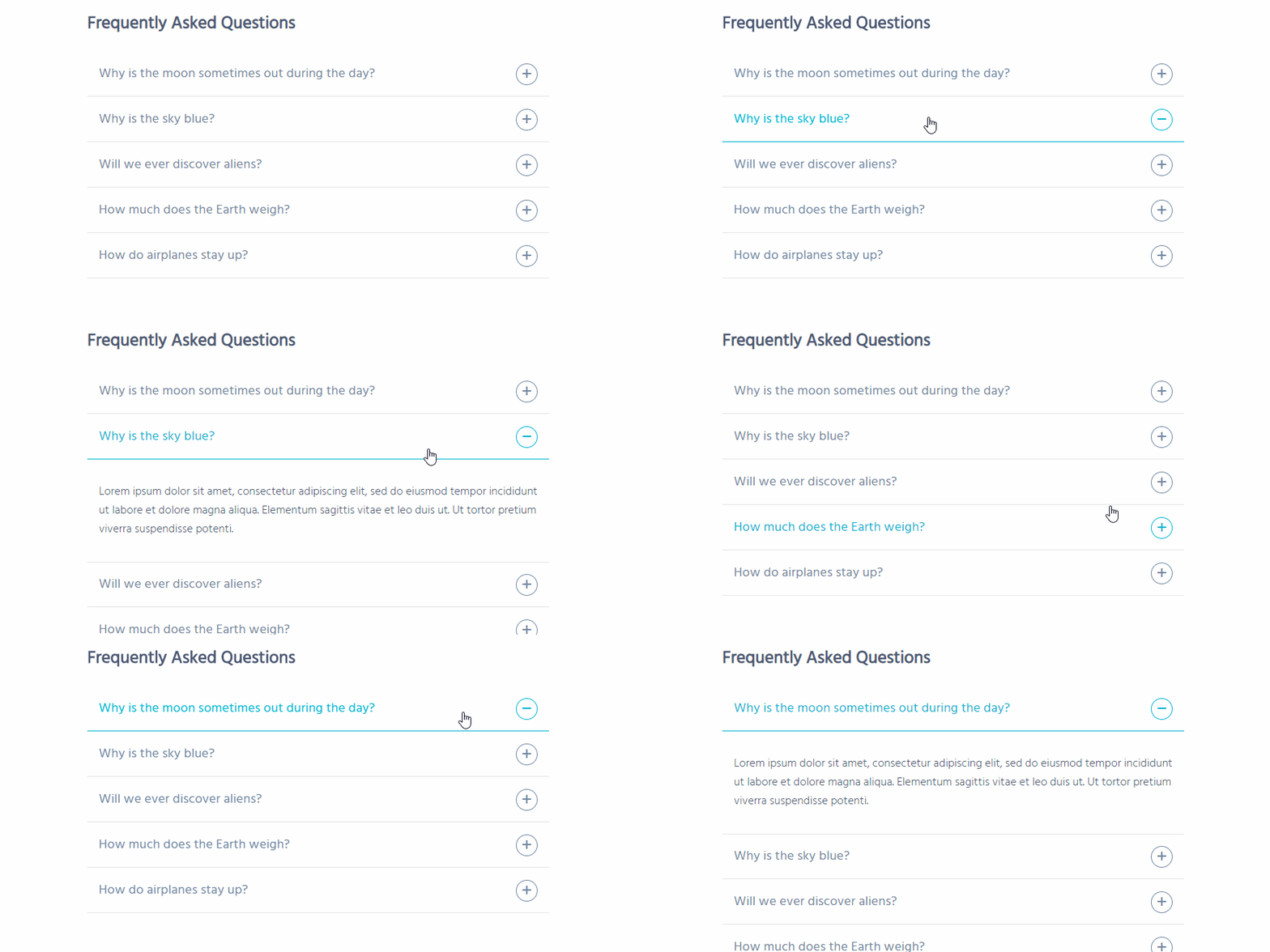
Examples of Feedback Loops in UI?
Examples of Feedback
Immediate
- Hover
- Active state
Short Delay
- Loading indicator
Completion
- Success message
- Confirmation
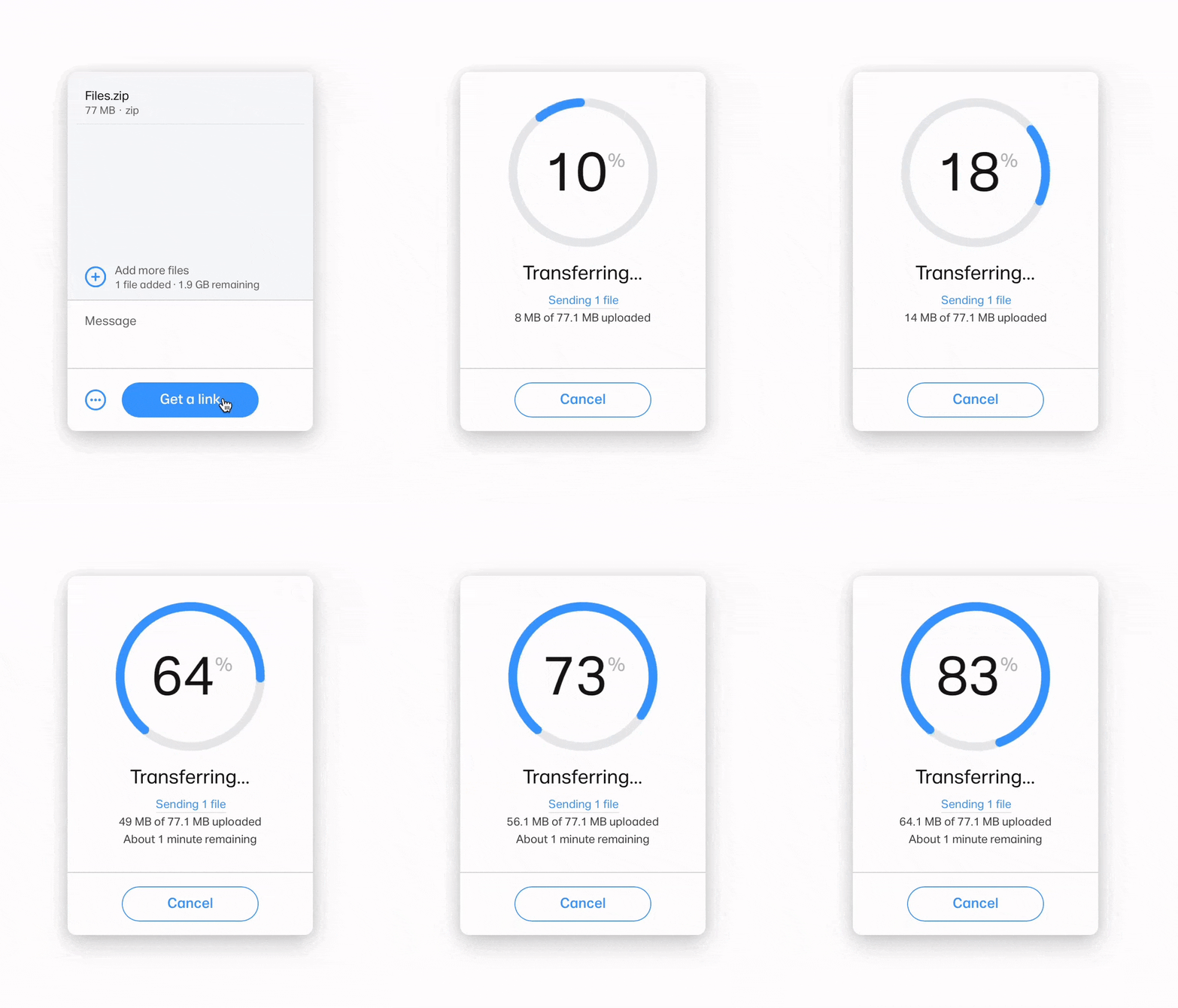
Invisible Feedback
Often unnoticed and very subtle.
Examples
- Button state changes
- Cursor changes
- Progress indicators
Feedback, although subtle is essential
Affordance
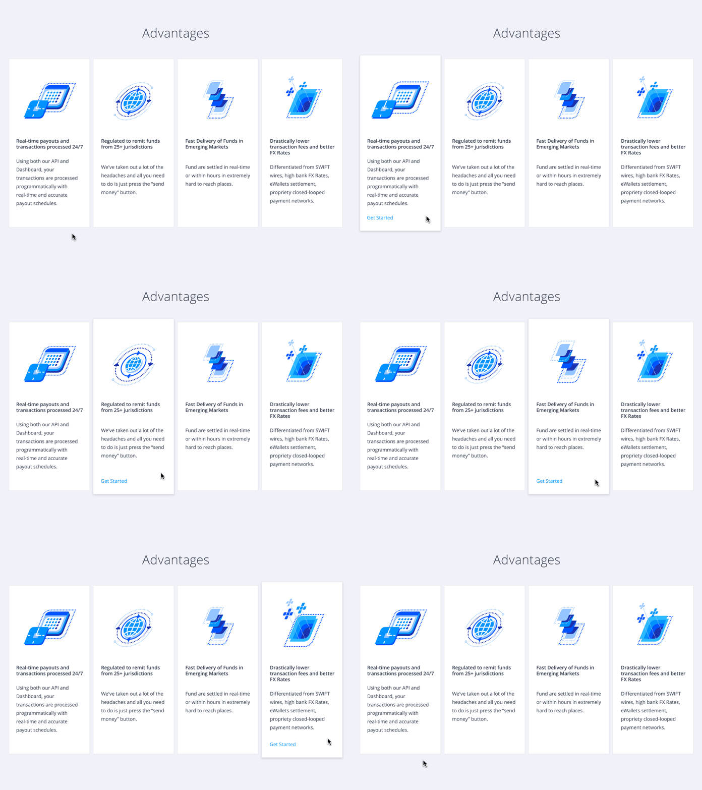
Decision making: Affordances
What can I do here?
Design suggesting action.
Examples
- Button
- Input field
- Slider
- Toggle
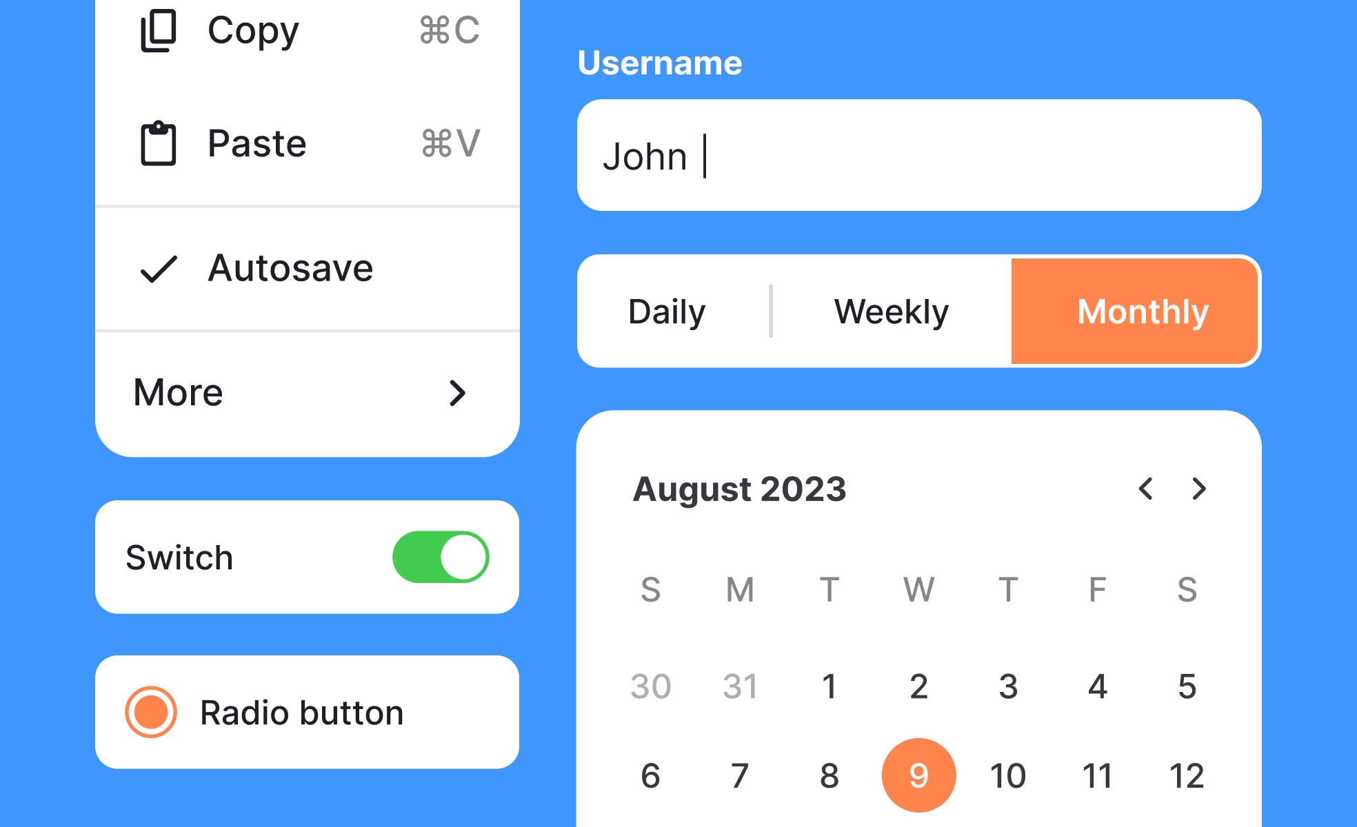
Common affordance failure
Is something:
- Clickable?
- Draggable?
- Interactive?
Consequence: User hesitation.
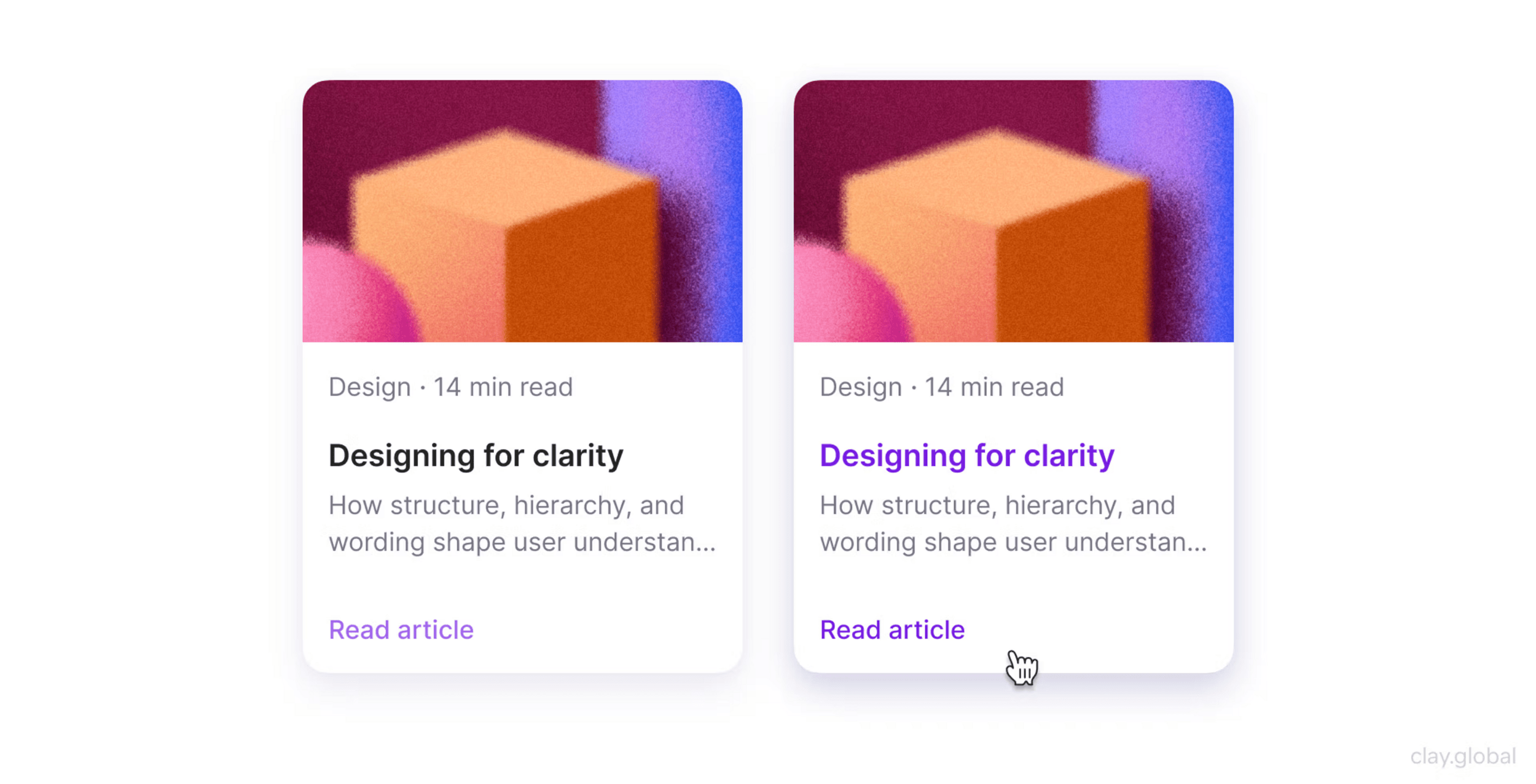
Signifiers of affordance?
What can indicate interaction?
Signifiers of affordance
Basic visual clues
- Shadow
- Color
- Shape
- Motion
Motion as Signifier
"Something can happen here."

Memory
Memory: Recognition vs Recall
Recognition
- Seeing options
Recall
- Remembering options
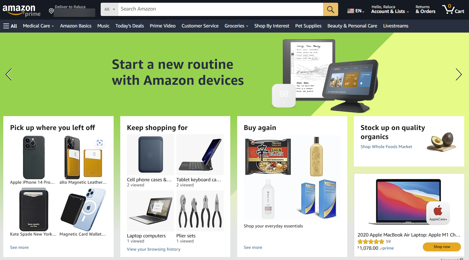
Examples?
Where is the menu located on a website?
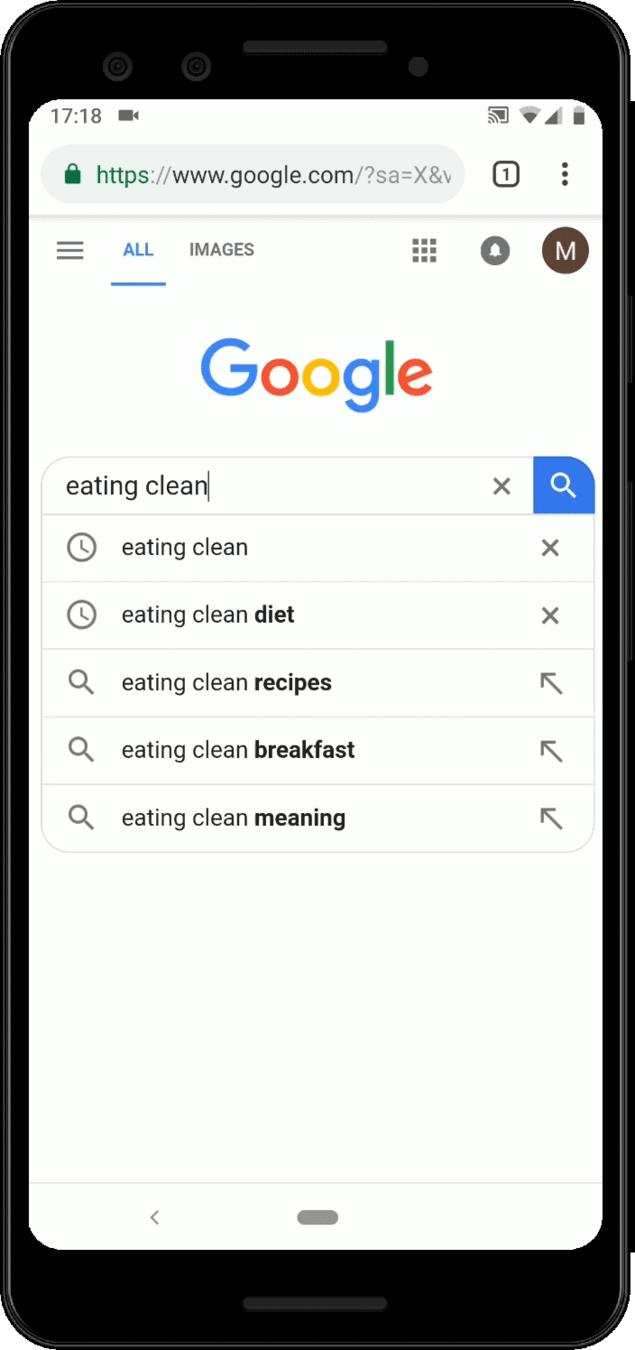
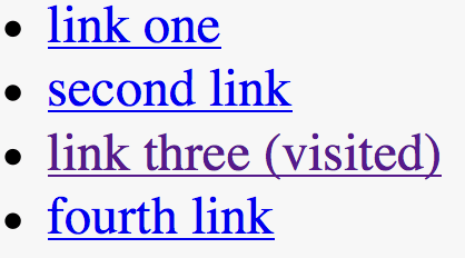
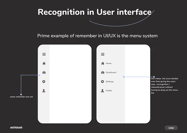
Recognition > Recall
Good
- Menus
- Visible tools
Difficult
- Hidden commands
- Memorization
Design should reduce memory load.
Mini Analysis Exercise
Choose on of the following services:
- Spotify
- Discord
- Notion
- Figma
- ...
Analyze and take screenshots of:
- Feedback
- Affordances
- Cognitive load
Motion & meaning
— Interactive Media Production
Motion is communication. Not decoration.
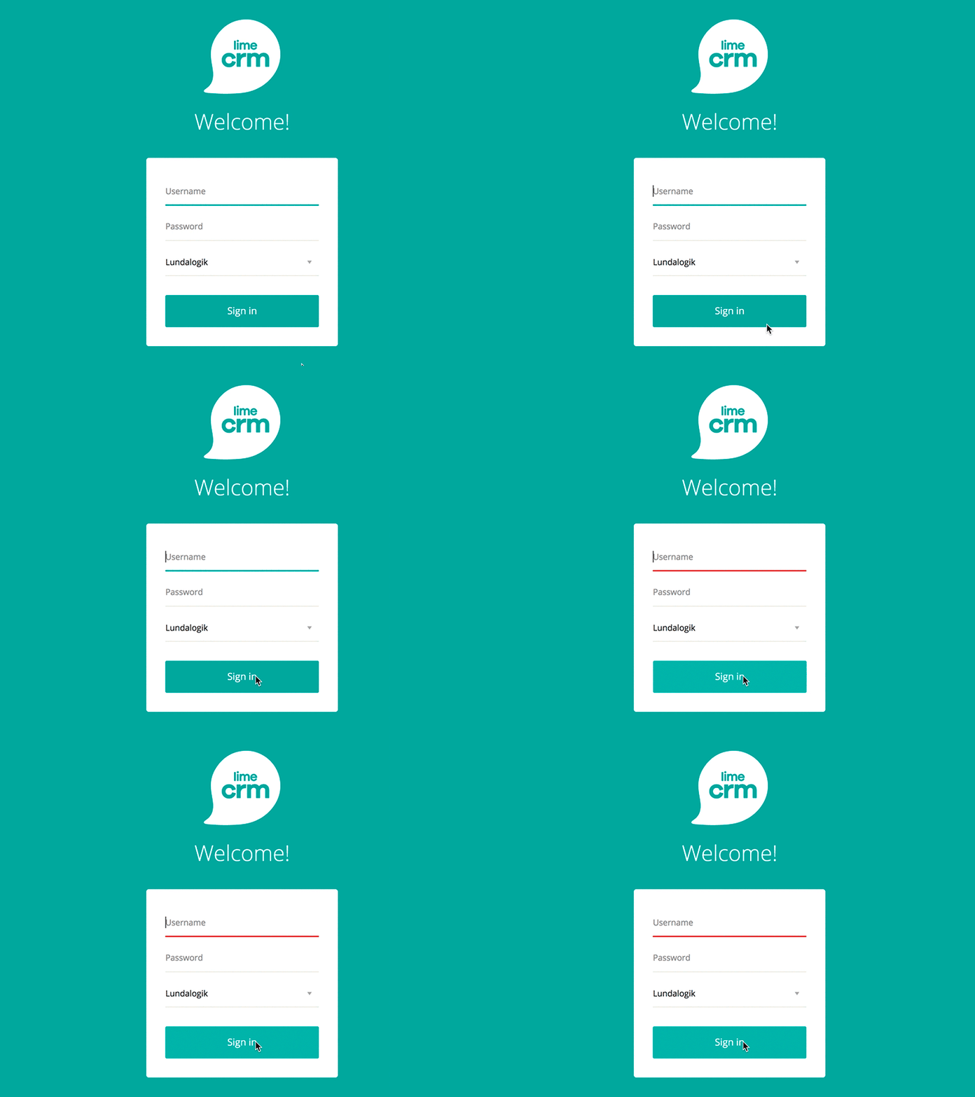
Motion and Interactive Media
Orientation
Guide and understanding location.
Feedback
Understanding consequence.
Hierarchy
Understanding importance.
Storytelling
Understanding sequence.
Functional Motion
Support usability.
Examples
- Menu opening
- Navigation transitions
- State changes
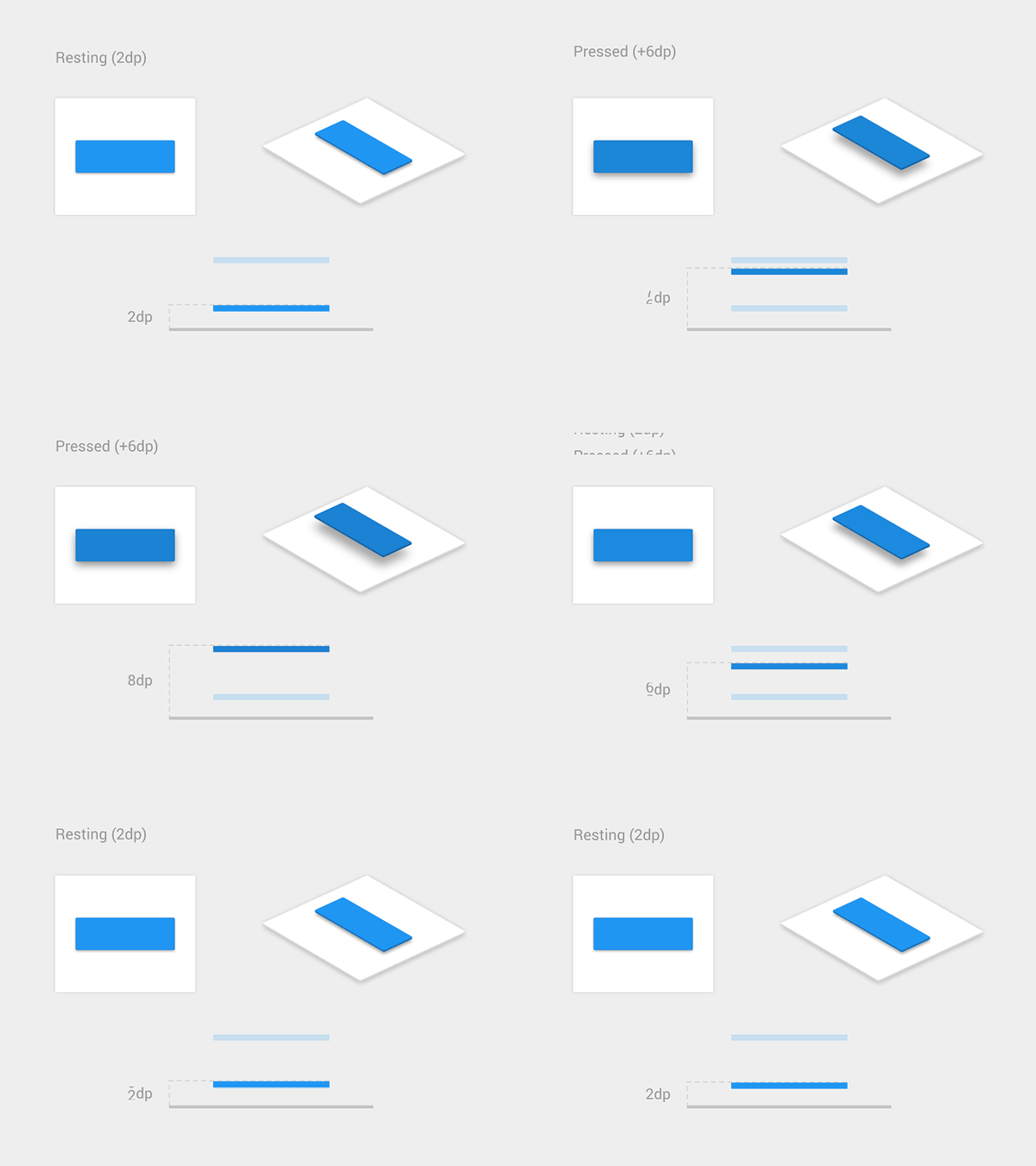
Decorative Motion
Character / Personality / Emotion
Risk
Distraction
Question to ask yourself?
Worth the cost?
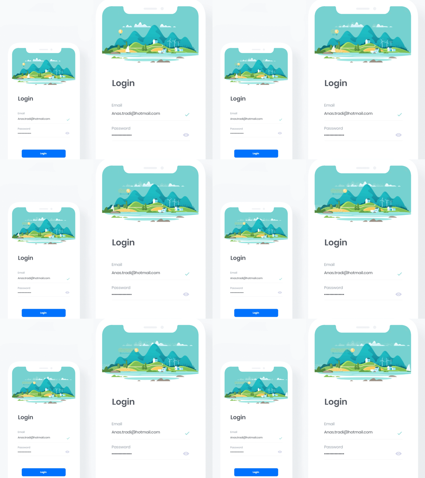
"Invisible Motion"
Best motion often goes unnoticed.
Supports
- Comprehension
- Flow
- Confidence
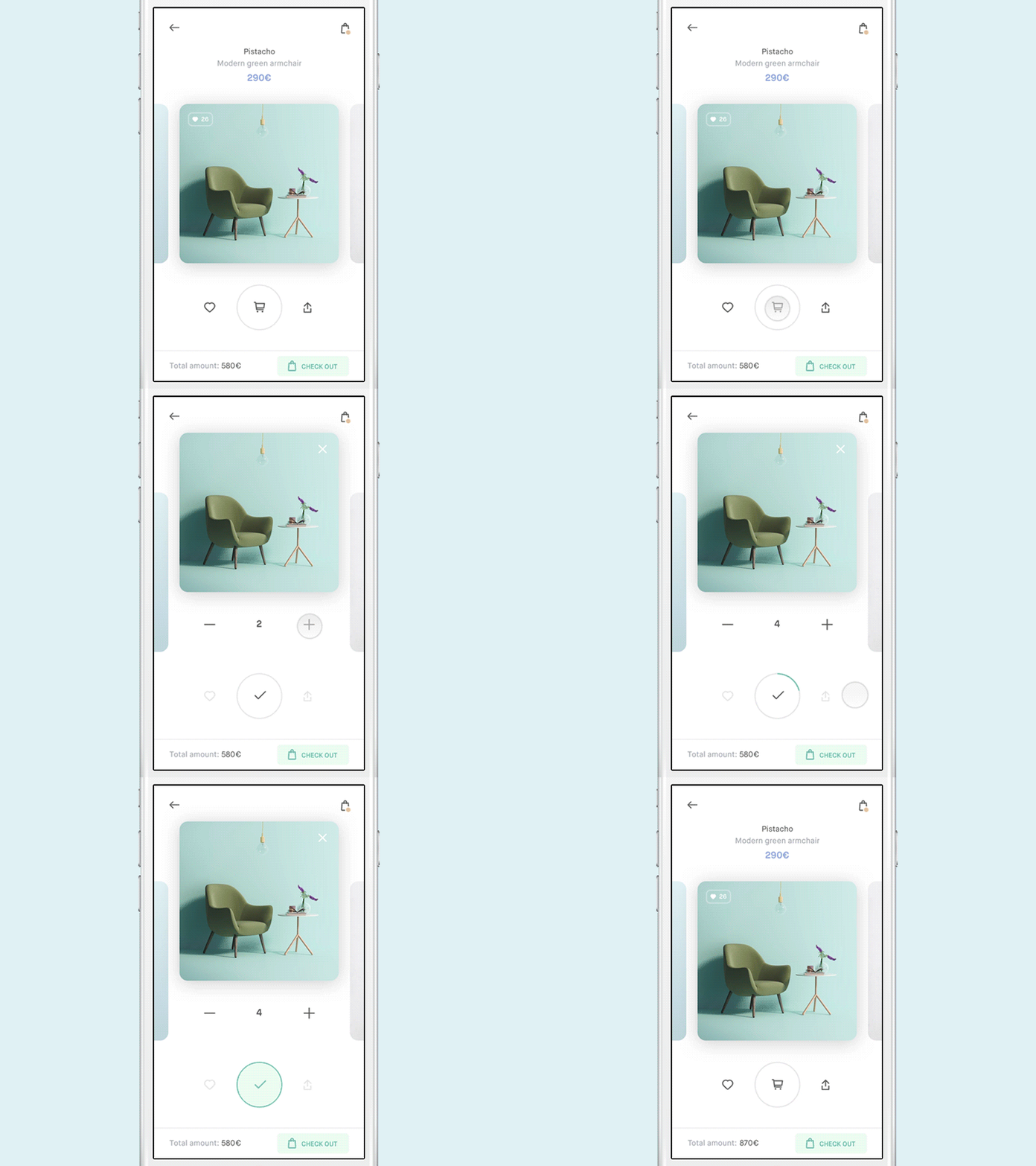
Examples of micro-interactions
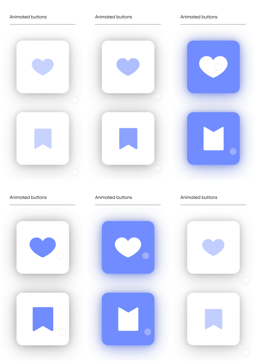
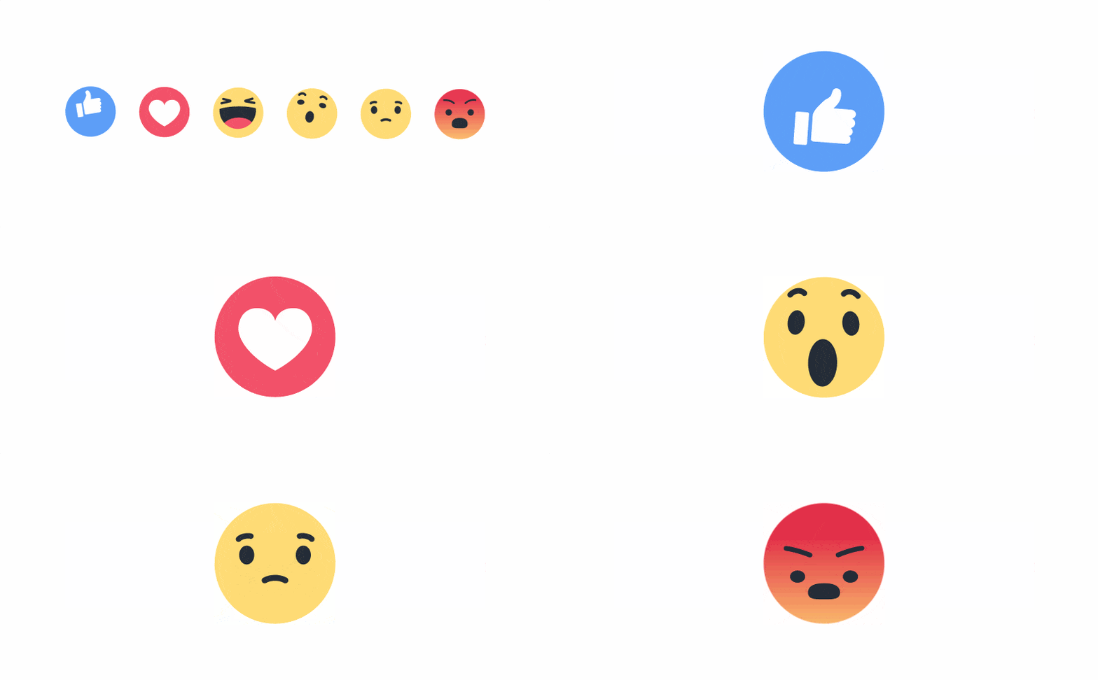

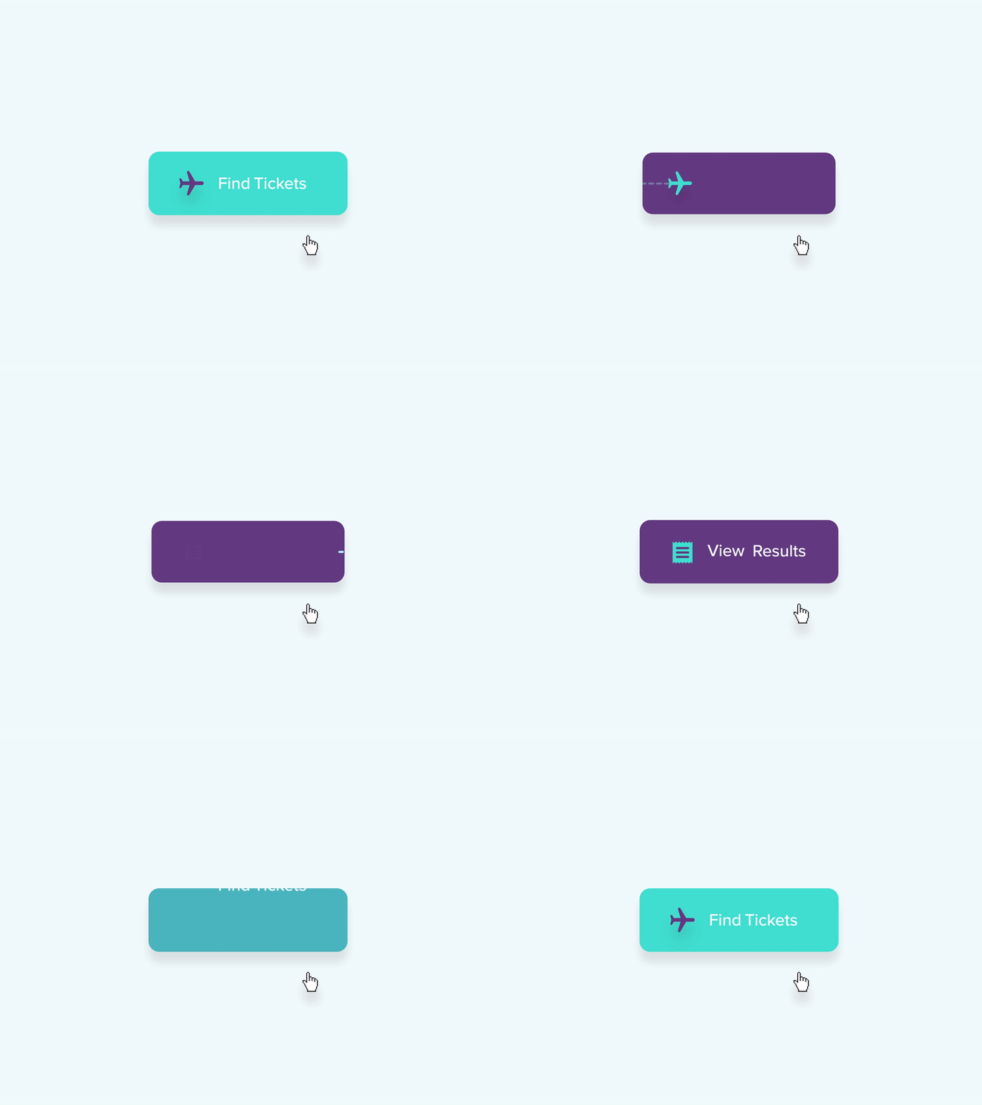
Motion principles?
- Timing
- Anticipation
- Continuity
- Focus
- Response
Timing
Speed and easing. Rythym and synchronization.
Questions to ask yourself?
- Too fast?
- Too slow?
- Appropriate?
Anticipation
Preparing the user before major change.
Benefits
- Predictability
- Comfort
- Clarity
Continuity
Objects stay connected, maintaining Relationships
Users should know:
- Where?
- Why?
- What changed?
Benefits
- Orientation
- Spatial understanding
Focus
Directing Attention
Motion attracts attention.
Design Question
Where should users look?
Response
Every action deserves a reaction.
Users need confirmation that:
- Input was received
- Action was completed
- System is working
Examples?
Exercise
Observe motion and identify motion principles.
Open a website, app or platform.
Examples:
- TikTok
- Apple
- Linear
- Stripe
- ...
Identify:
- Timing
- Anticipation
- Continuity
- Focus
- Response
Discussion with a fellow student:
Which principle is used best? Why?
Extra:
Which principle is visible? Why is it effective? Could it be improved?