Motion Design Fundamentals
What is on the program?
- Why motion?
- Timing
- Easing
- Disney Principles for UI
- Continuity & Spatial Design
- Trends & Best Practices
- Mini exercises in Figma / Figma Motion
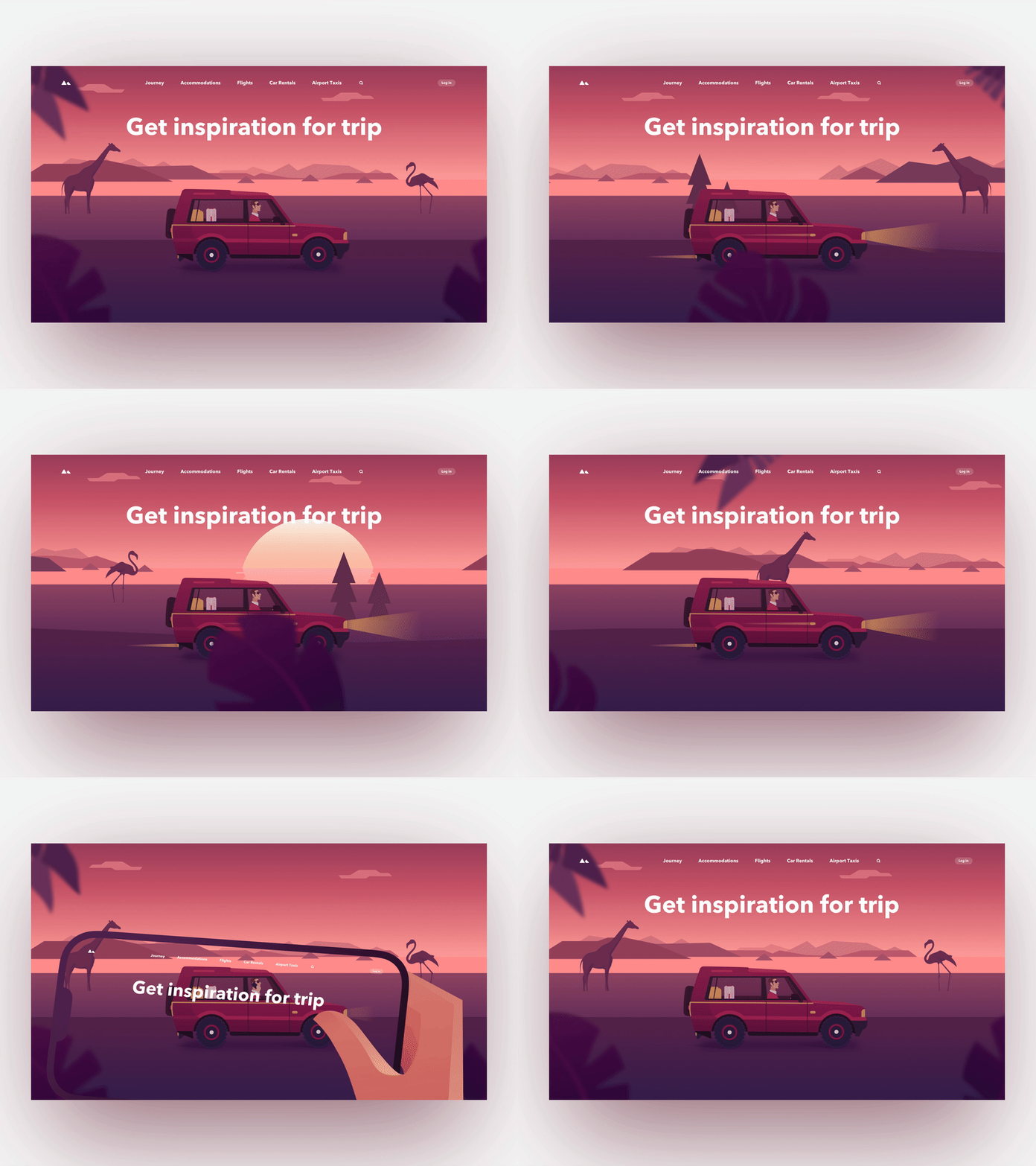
An interface?
— Motion Design
An interface?
What does an interface consist of?
- Typography
- Color
- Layout
- Images
- Motion
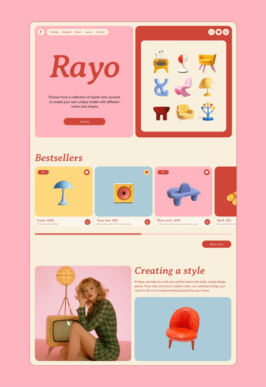
- Typography
- Color
- Layout
- Images
- Motion
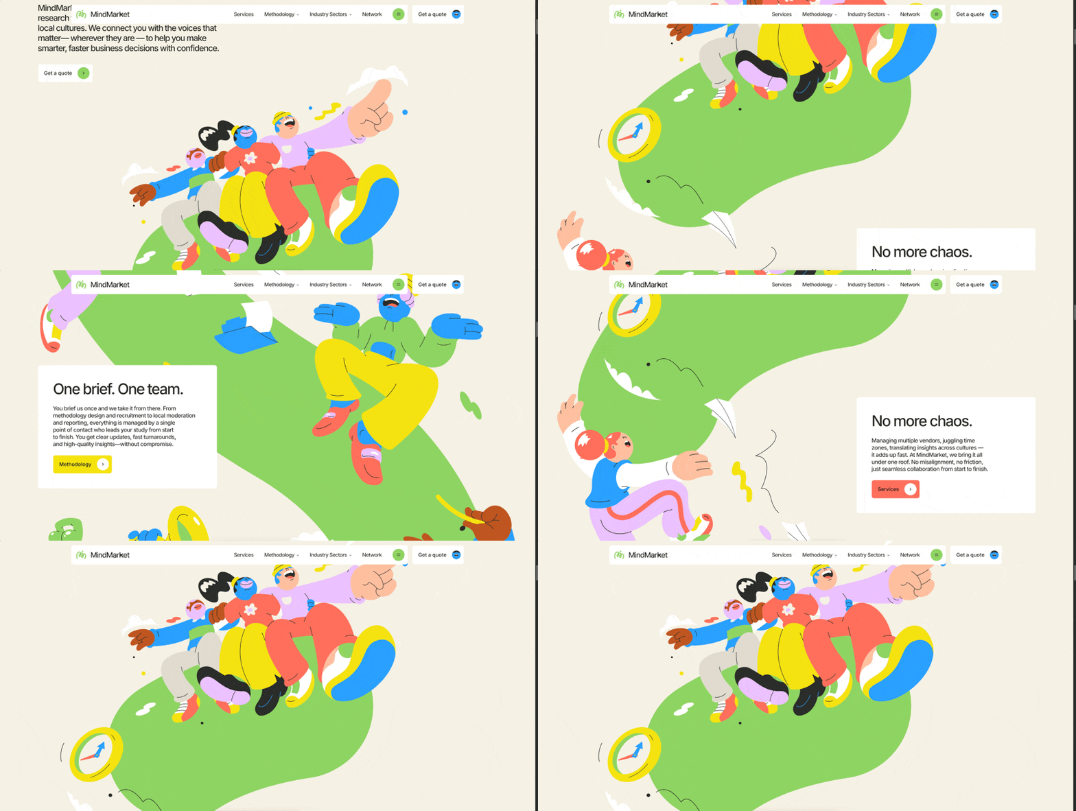
Why use motion?
— Motion Design
- Loss of context
- Confusion
- Cognitive load
- Lack of feedback
Motion ≠ Decoration
Motion is communication.
Motion helps users:
- Understand
- Orient
- Focus
- Build trust
Examples?
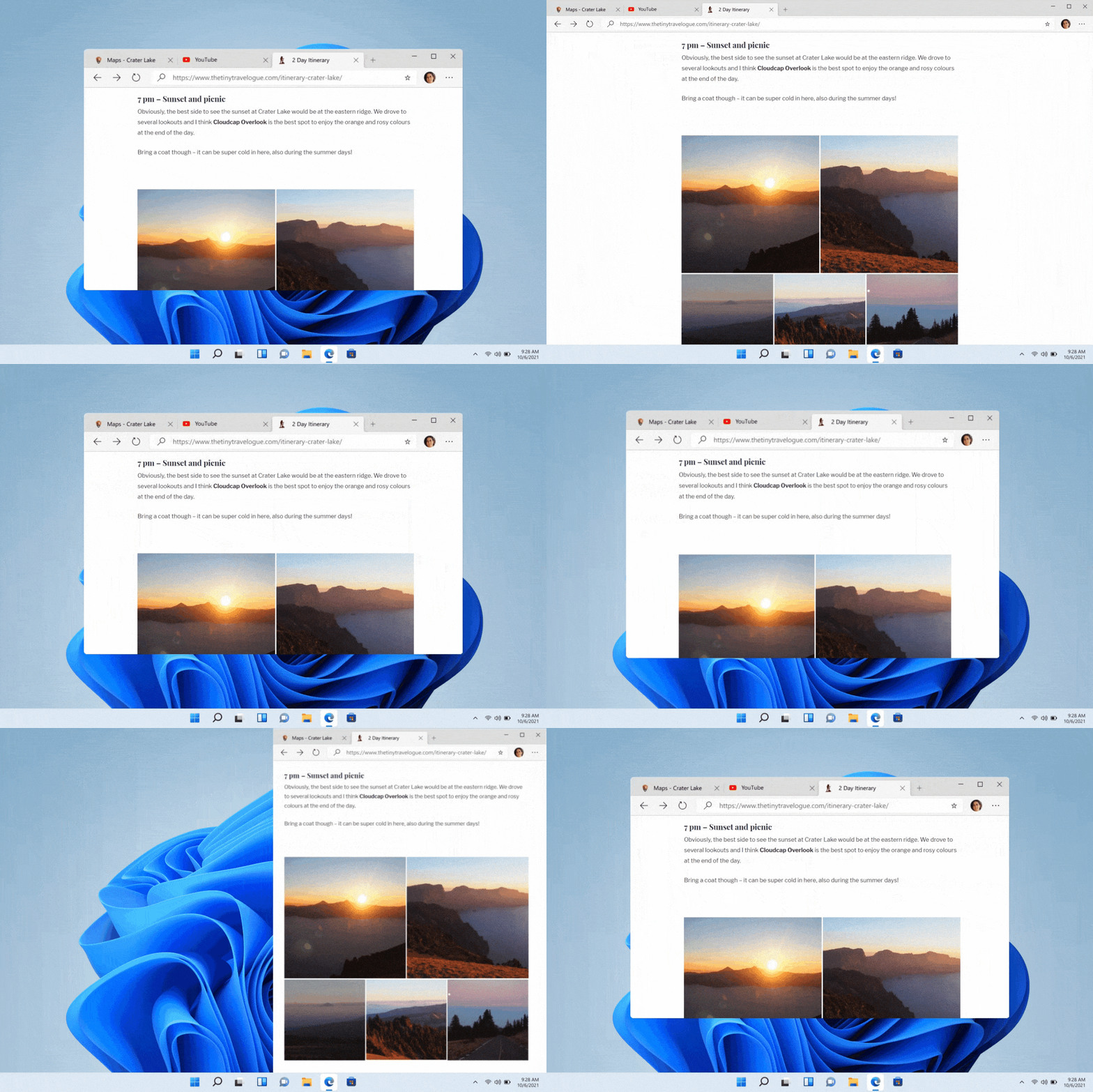
Motion is communication.
- Understand
What happened?
- Orient
Where does it come from? Where is it going?
- Focus
What is important?
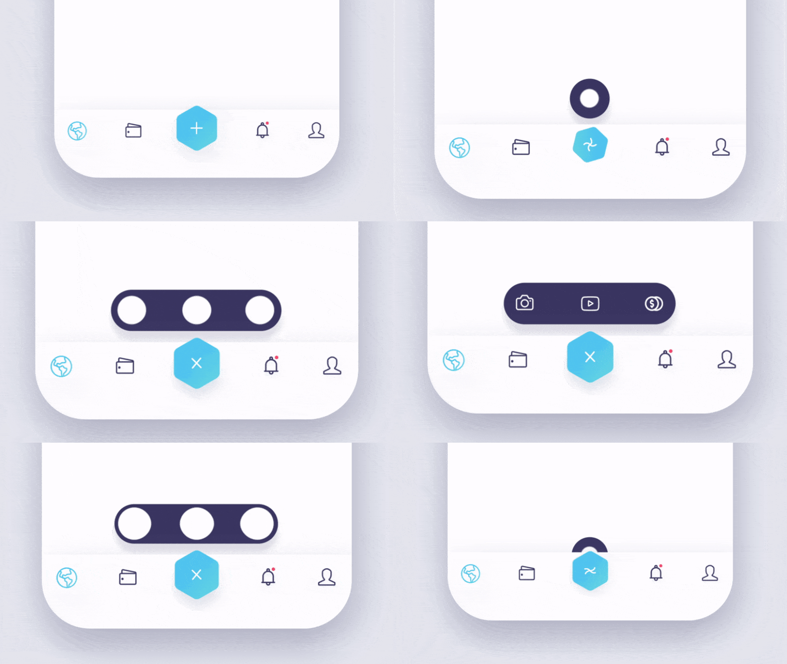
When to use motion?
— Motion Design
When does Motion add value?
✅ Feedback
✅ Continuity
✅ Focus
✅ Orientation
✅ Hierarchy
Bad Motion?
- Random
- Too slow
- Too much movement
- Purely decorative
Does this help the user?
1. UX Improvement: Feedback
User performs an action.
Interface responds.
Examples:
- Like
- Toggle
- Form submit
- Refresh

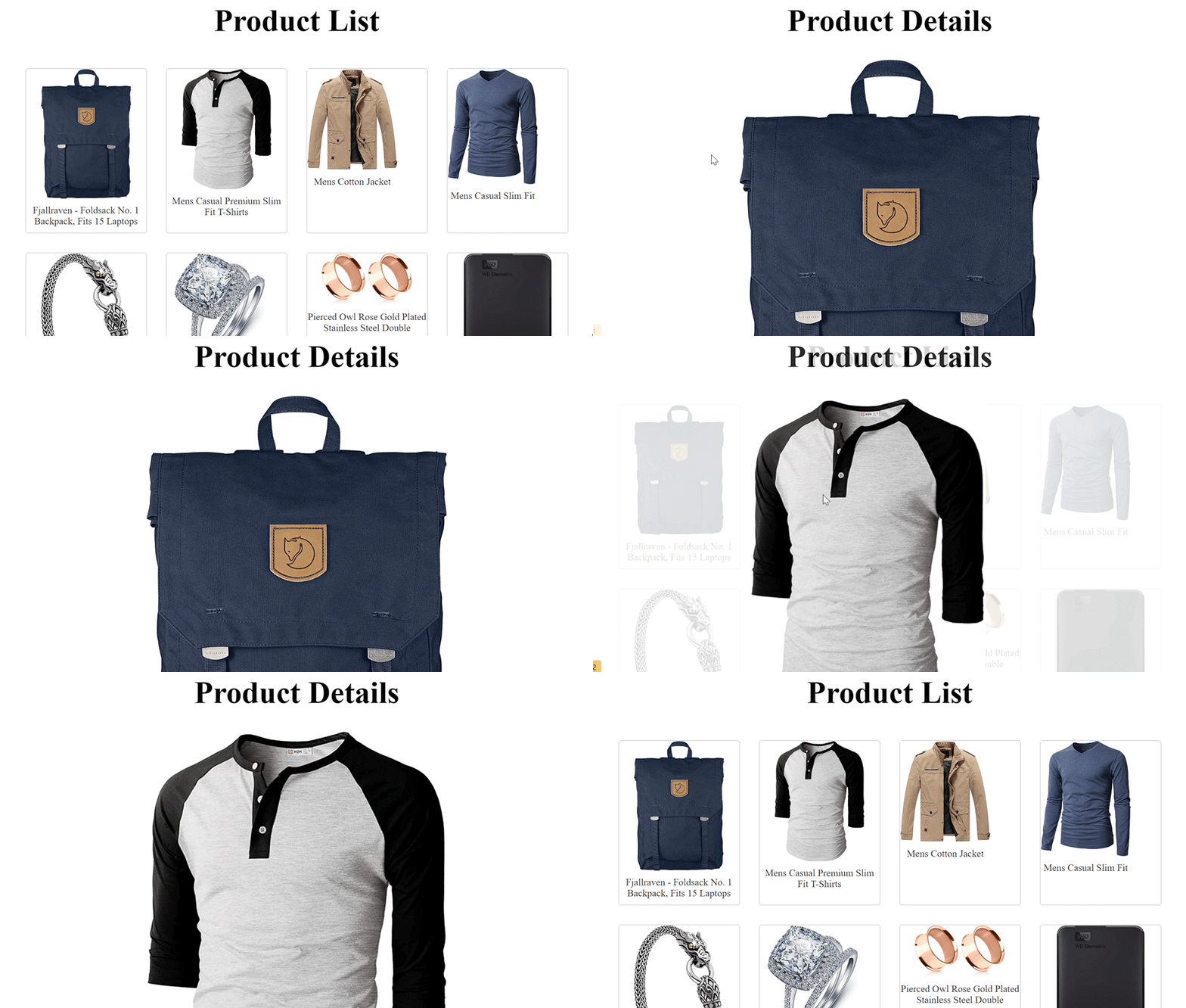
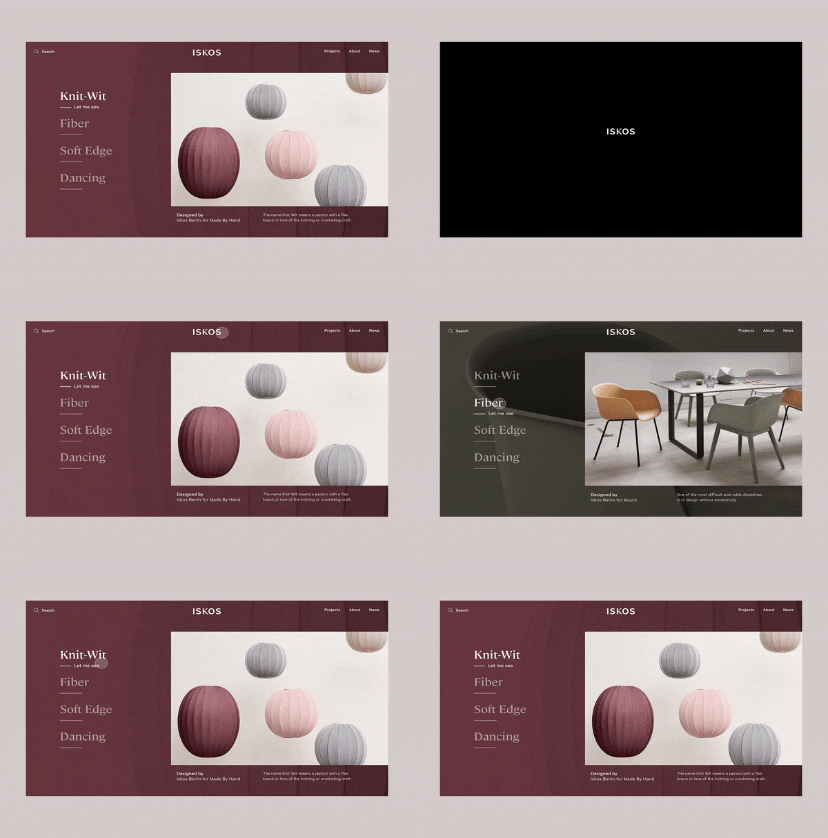
2. UX Improvement: Continuity
User builds a mental map.
Motion helps show relationships between screens.
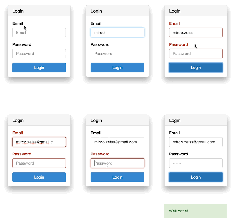
3. UX Improvement: Focus
Motion directs attention.
- Error
- Alert
- Snackbar
- CTA
Timing
— Motion Design
One of the most important motion concepts.
Timing determines:
- Weight
- Speed
- Personality
What is Good Timing?
Too fast:
❌ Not visible + Stress?
Too slow:
❌ Frustrating
Goal:
✅ Natural
Think about the physical world.
Timing Guidelines
Micro-interactions
100–200ms
Example: buttons, checkbox, hover
UI Transitions
200–400ms
Example: Opening panels, dropdowns, cards
Navigation
300–600ms
Example: page transitions, modals (dialog panels)
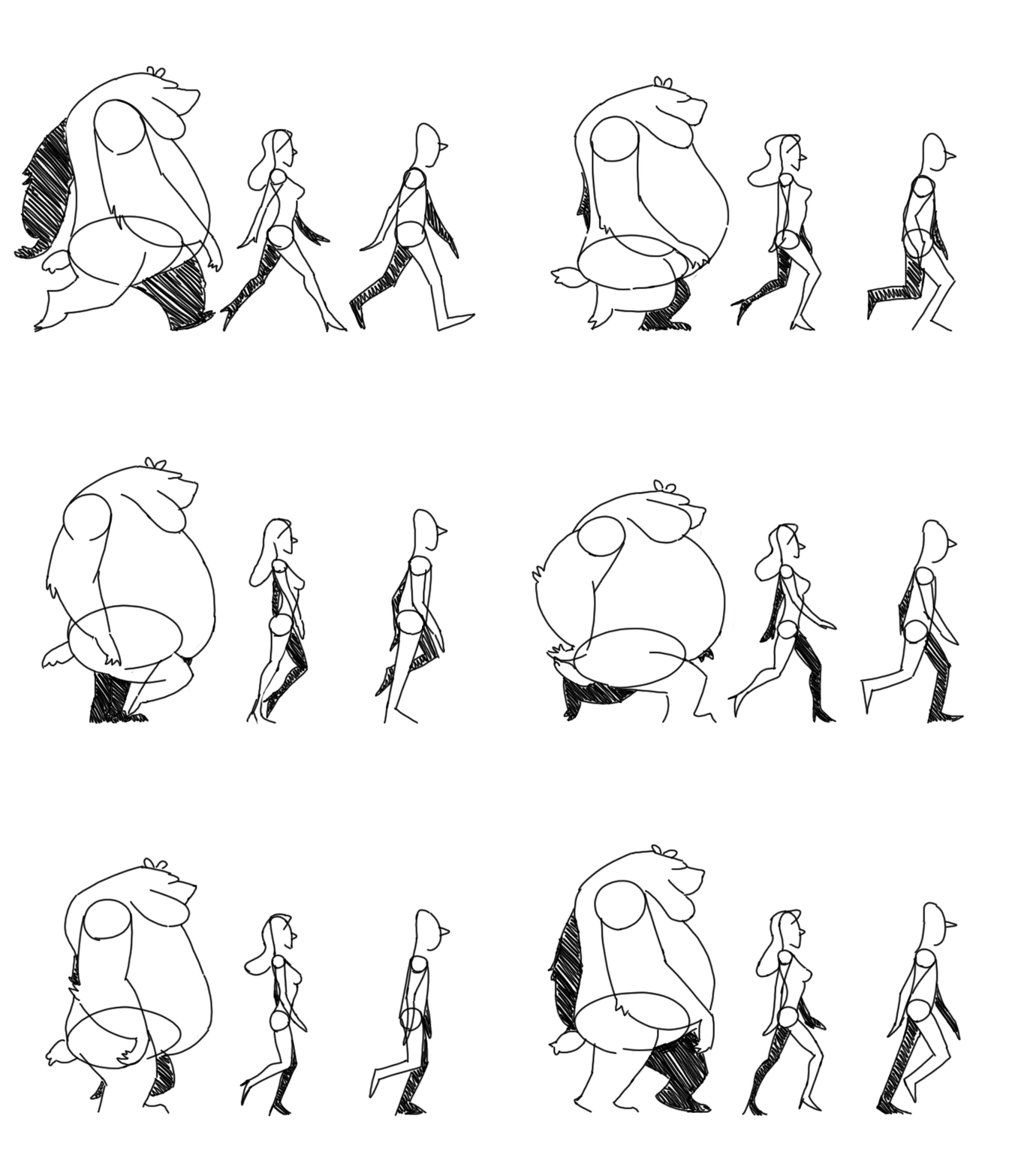
Weight & Timing
Small object (weighs less)
→ faster
Large panel (weighs more)
→ slower
Class demo Figma Motion
Opening menu:
- 100ms
- 300ms
- 800ms
Observe:
- Readability
- Reactivity
- Quality
Easing
— Motion Design
Easing
Not just:
How long?
But also:
How does it move?
Why Easing?
In the real world:
Objects do not start and stop abruptly.
Neither do interfaces.

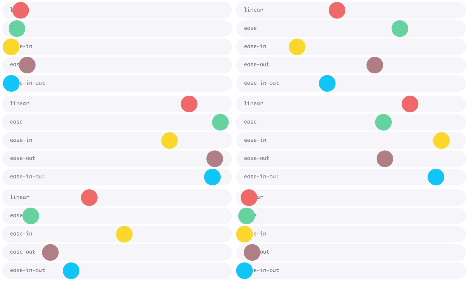
Linear
Constant speed
Use for:
- Progress bars
- Loaders
- Color
Rarely for UI transitions
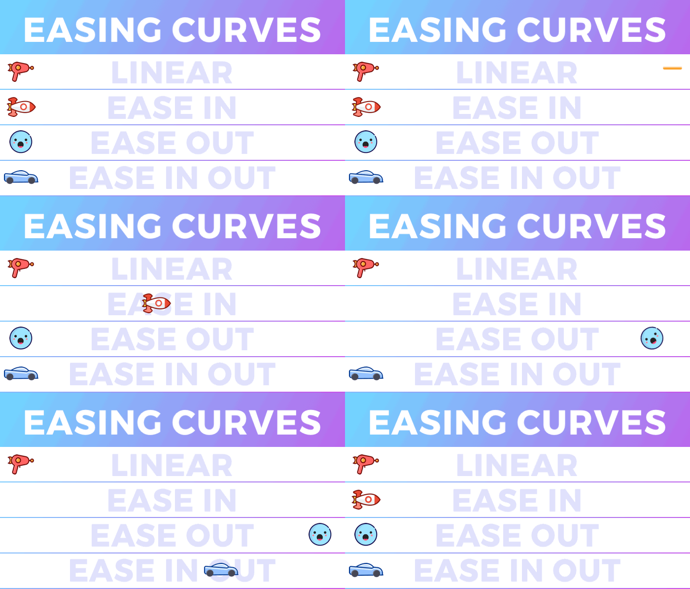
Ease Out
Start fast,
Stop slow
✅ Most used in UI
Ease In
Start slow,
End fast
When to use:
- Exiting objects
Ease In Out
Gentle start
Fast middle phase
Gentle stop
Perfect for larger movements
Why Ease Out Is Popular
Feels:
- Responsive
- Natural
- Premium
User gets immediate feedback
Mini Exercise
Apply different easings to the same menu animation:
- Linear
- Ease Out
- Ease In-Out
Which one feels best?
Why?
Motion & Disney?
— Motion Design
Disney Principles
Not all 12 are relevant.
Important for interfaces:
- Anticipation
- Staging
- Follow Through
- Secondary Action
- Timing
- Slow In / Slow Out
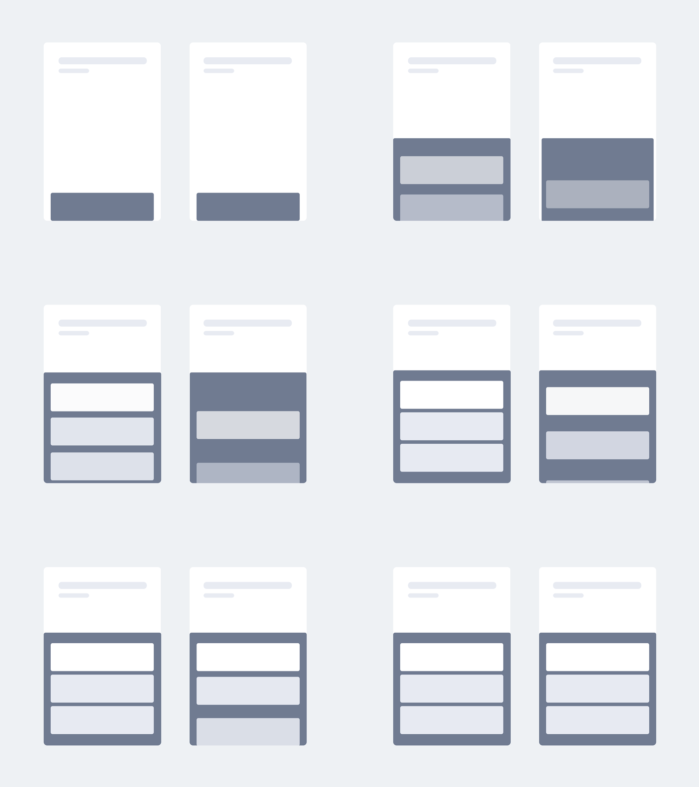

Anticipation
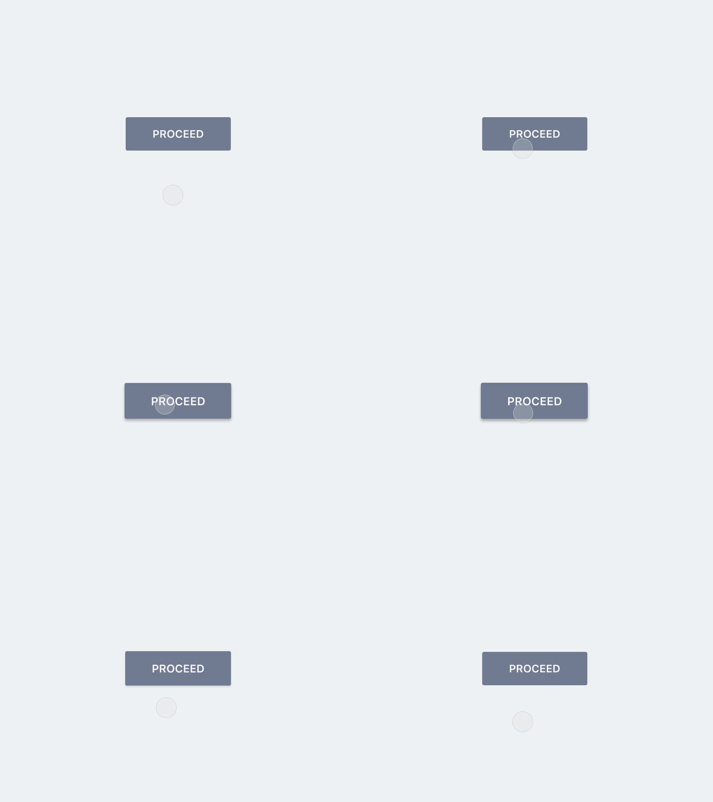
Small preparation before action.
Example:
Button:
98% → 102% → 100%
Why Anticipation Works
Human brains:
➡️ predict movement
Result:
- More clarity
- More feedback
Staging
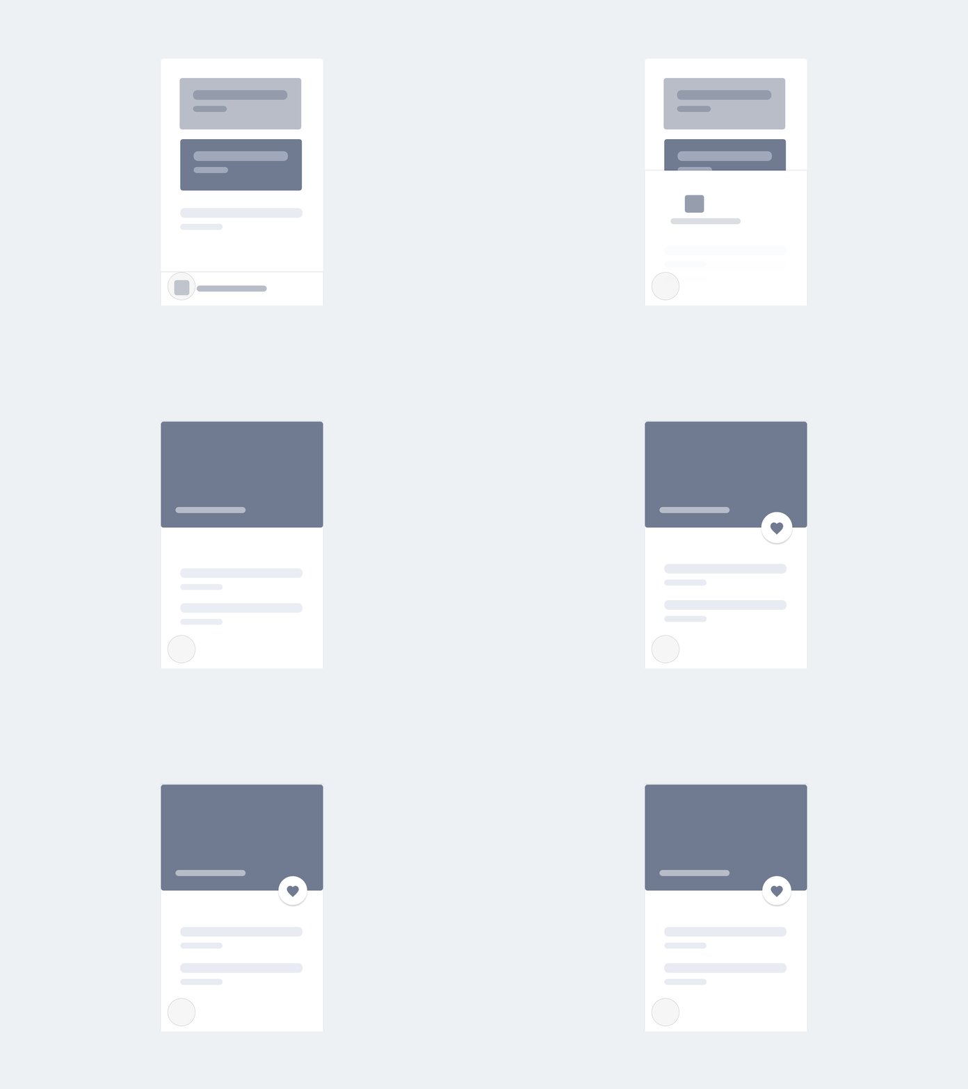
Create focus: Where should the user look?
Its purpose is to direct the audience's attention, and make it clear what is of greatest importance in a scene;
Techniques:
- Blur
- Fade
- Scale
- Contrast
Follow Through
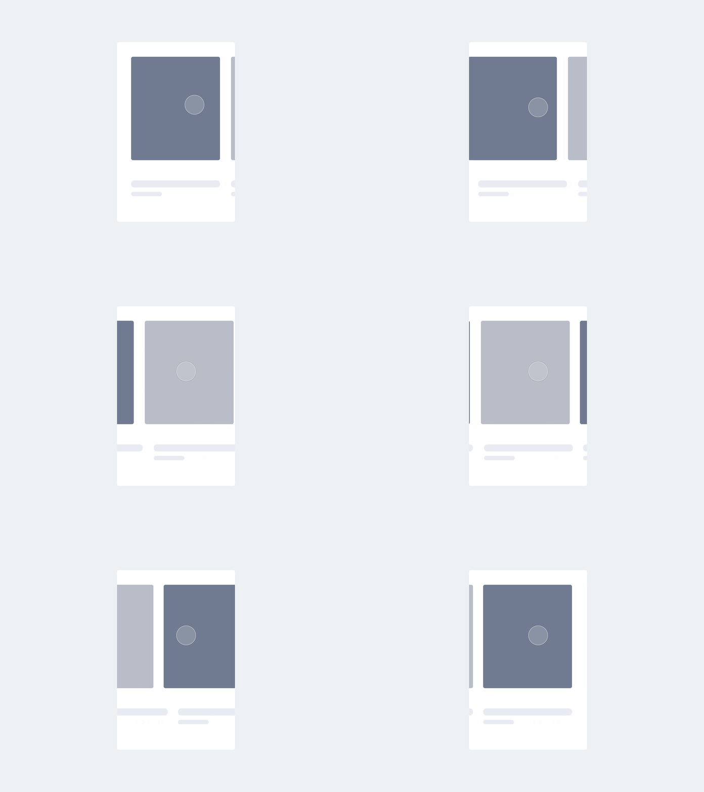
Not everything stops at the same time.
Example:
- Panel stops
- Shadow disappears later
Feels organic
Secondary Action
Main action
Is emphasized thanks to secondary action.
Subtle supporting movement
Example:
Card + icon

Exercise
Animate a CTA Button in Figma Motion and make two versions, using the following concepts:
Version A: Simple
- Scale
Version B
- Anticipation
- Secondary Action
Compare the feeling
Spatial Relationships
— Motion Design
Spatial Relationships
Important UX Motion Concept:
Motion shows relationships.
Everything Comes From Somewhere
Elements:
❌ do not just appear
❌ do not just disappear
✅ have an origin
✅ have a destination
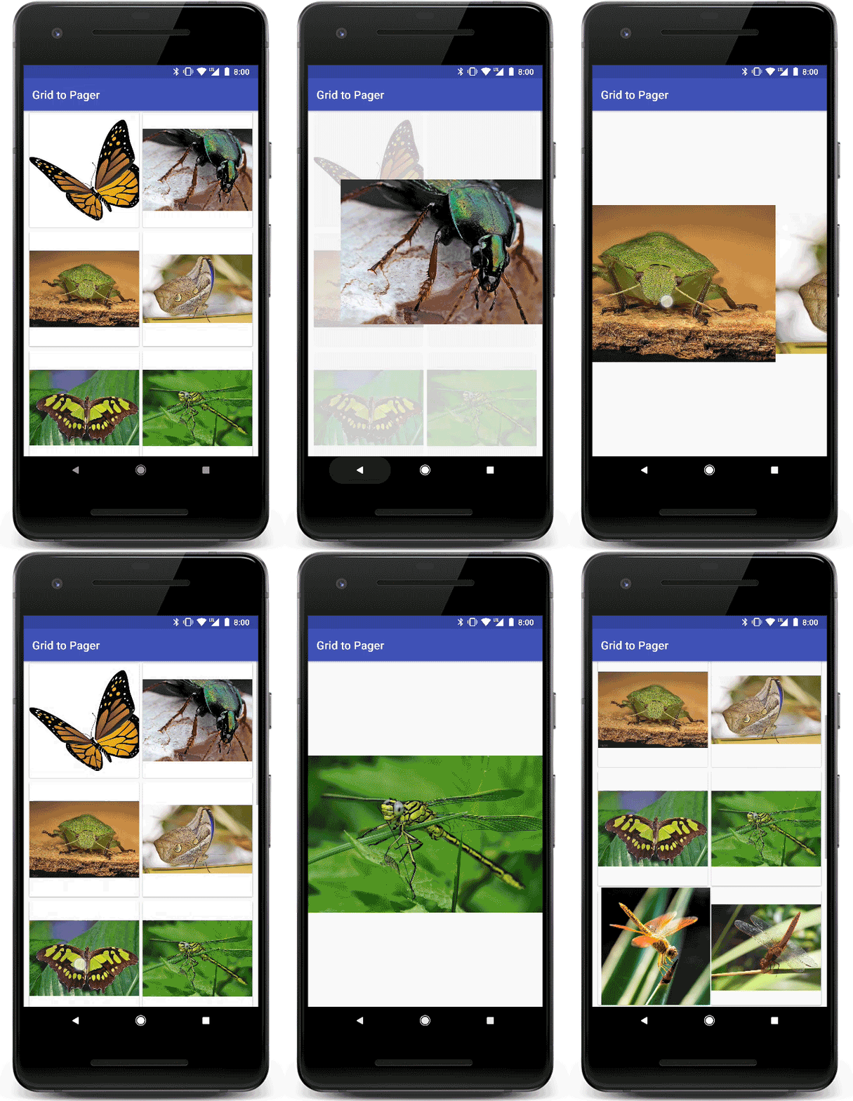
Shared Element Transition
Think of "Continuity", this aligns with that.
Card
↓
Detail page
User understands:
This is the same object.
Exercise in Figma
Product Card
↓
Product Detail
Create a Shared Element Transition.
Recap
— Motion Design
What Works Today?
Popular patterns:
- Microinteractions
- Shared Elements
- Skeleton Loading
- Scroll Motion
But what about accessibility?
Not everyone experiences motion the same way.
Consider:
- Motion sensitivity
- Vestibular disorders
Use motion consciously.
When No Motion?
No clear purpose?
➡️ Remove it.
Good motion:
- Informs
- Orients
- Guides