


Content ITV PRO
This is Itvedant Content department
Learning Outcome
6
Apply Matplotlib (including subplots) to PS4 sales scenarios
5
Select appropriate plot types for different analytical questions
4
Create and interpret basic plots (line, bar, scatter)
3
Understand the PS4 sales dataset used for analysis
2
Install and verify Matplotlib setup
1
Define Matplotlib and its purpose in data visualization
Previously covered topics :
Navigating DataFrames and Series
Data Preparation Essentials
Unlocking Pivot Table Techniques
Turning Raw Data into Insights
Deep Dive Into Data Analysis
Hook/Story/Analogy(Slide 4)
Transition from Analogy to Technical Concept(Slide 5)
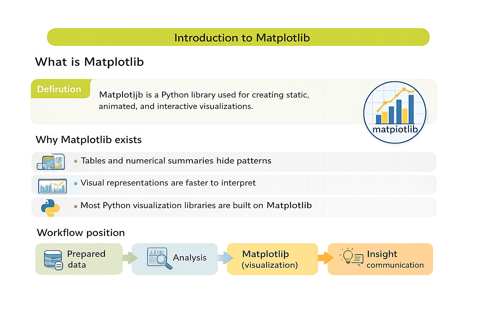
Introduction to Matplotlib
What is Matplotlib?
Matplotlib is a Python library used for creating static, animated, and
interactive visualizations
Why Matplotlib exists?
Tables and numerical summaries hide patterns
Visual representations are faster to interpret
Most Python visualization libraries are built on Matplotlib
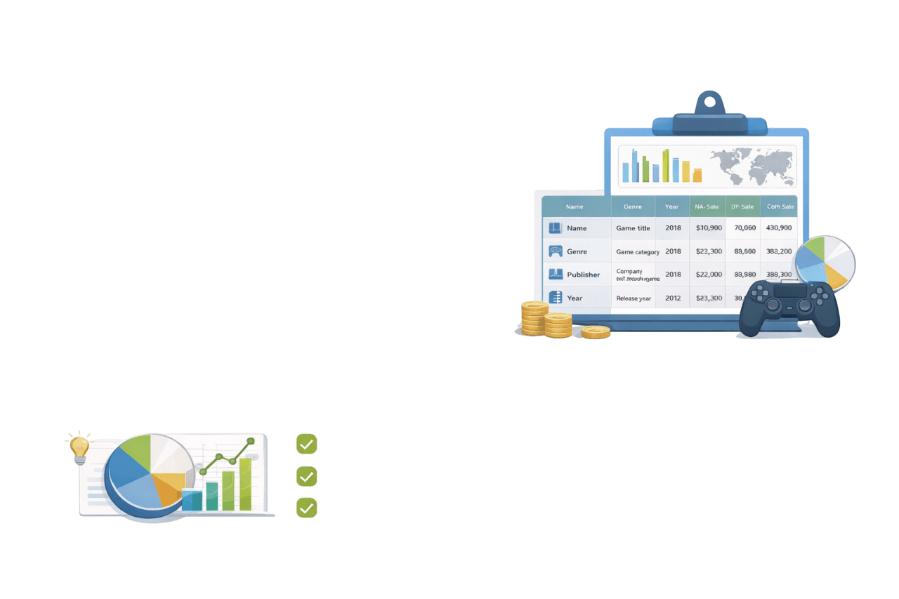
Understanding the PS4 Sales Dataset
What this dataset represents?
The PS4 sales dataset contains historical sales information for PlayStation 4 games, aggregated across regions, time periods, and categories
Typical columns
Ideal for visualization as it combines categorical and numerical data and supports clear business-style comparisons and trends
Installation
pip install matplotlib

conda install matplotlib
Verification
import matplotlib.pyplot as plt
print(plt.__version__)
pyplot provides plotting functions
plt is the standard alias
Installing and Setting Up Matplotlib
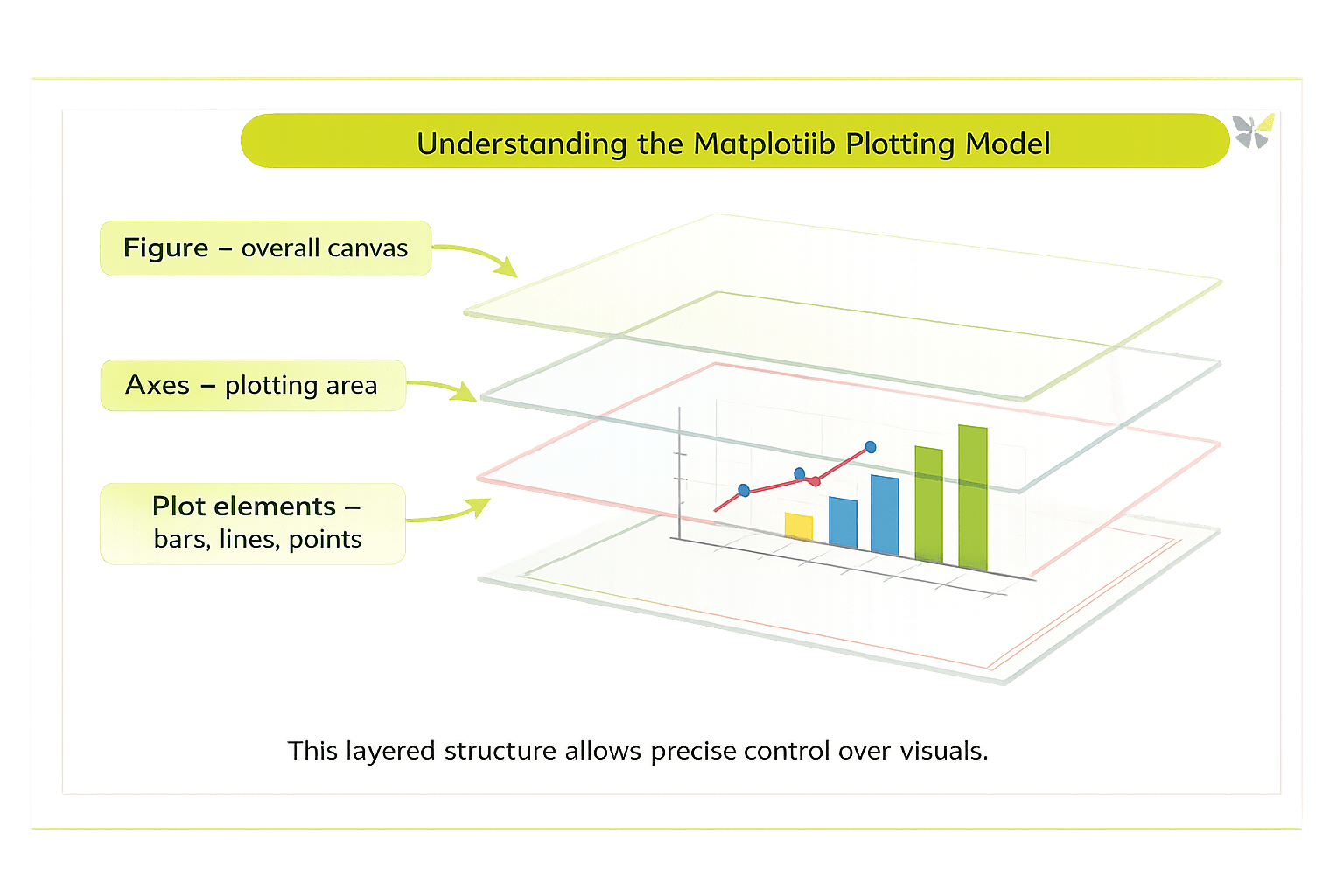
Understanding the Matplotlib Plotting Model
Figure - Overall Canvas
Axes – plotting area
Plot elements – bars, lines, points
This layered structure allows precise control over visuals
Compare values across discrete categories.
PS4 sales examples:
Sales by genre
Sales by region
Publisher-wise sales
categories = ["Action", "Sports", "RPG", "Racing"]
values = [120, 95, 80, 60]

plt.bar(categories, values)
plt.title("PS4 Sales by Genre")
plt.xlabel("Genre")
plt.ylabel("Sales (Millions)")
plt.show()
Bar Plots – Comparing Categories
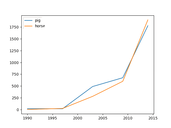
Show how values change across time
PS4 sales examples:
Year-wise global sales trend
years = [2016, 2017, 2018, 2019, 2020]
sales = [150, 170, 160, 140, 110]

plt.plot(years, sales)
plt.title("PS4 Global Sales Trend")
plt.xlabel("Year")
plt.ylabel("Sales (Millions)")
plt.show()
Line Plots – Tracking Trends Over Time
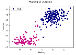
Analyse relationships between numerical variables
PS4 sales examples:
Critic score vs global sales
critic_score = [70, 85, 90, 60, 95]
global_sales = [3.2, 5.1, 6.8, 2.4, 7.3]

plt.scatter(critic_score, global_sales)
plt.title("Critic Score vs Global Sales")
plt.xlabel("Critic Score")
plt.ylabel("Global Sales (Millions)")
plt.show()
Scatter Plots – Exploring Relationships
Show part-to-whole relationships
PS4 sales examples:
Regional contribution to total sales
regions = ["NA", "EU", "JP", "Other"]
sales = [40, 35, 15, 10]

plt.pie(sales, labels=regions, autopct="%1.1f%%", startangle=140)
plt.title("Regional Sales Share")
plt.axis("equal")
plt.show()
Pie Charts – Showing Proportions
Understand how numerical values are distributed
PS4 sales examples:
Distribution of global sales per game
import numpy as np

global_sales = np.random.normal(5, 2, 1000)

plt.hist(global_sales, bins=30)
plt.title("Distribution of PS4 Global Sales")
plt.xlabel("Sales (Millions)")
plt.ylabel("Frequency")
plt.show()
Histograms – Visualizing Data Distribution
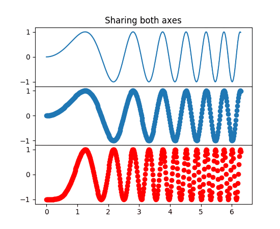
Using Subplots – Visualizing Multiple Views Together
Subplots allow multiple related plots to be displayed in a single figure, enabling side-by-side or stacked comparison
Why subplots are needed?
Comparing trends across regions
Viewing different metrics together
Reducing the need for multiple separate figures
fig, axes = plt.subplots(1, 2, figsize=(10, 4))

# Bar plot
axes[0].bar(categories, values)
axes[0].set_title("Sales by Genre")

# Line plot
axes[1].plot(years, sales)
axes[1].set_title("Sales Trend Over Time")

plt.tight_layout()
plt.show()
Explanation:
plt.subplots(1, 2) creates one row with two plots
axes[0] and axes[1] refer to individual plots
tight_layout() prevents overlap
Best practices:
Keep related plots together
Use consistent scales when comparing
Avoid overcrowding with too many subplots
Choosing the Right Plot Type
Comparison → Bar plot
Trend → Line plot
Relationship → Scatter plot
Proportion → Pie chart
Multi-view comparison → Subplots
Distribution → Histogram
5
Visualization communicates prepared insights
4
Subplots enable multi-perspective analysis in one view
3
Different plots answer different questions
2
PS4 sales data provides realistic analytical scenarios
1
Matplotlib is the foundation of Python visualization
Summary
Quiz
Which plot is best for comparing PS4 sales across genres?
A. Histogram
B. Line plot
C. Bar plot
D. Pie chart
Quiz-Answer
Which plot is best for comparing PS4 sales across genres?
A. Histogram
B. Line plot
C. Bar plot
D. Pie chart
By Content ITV


